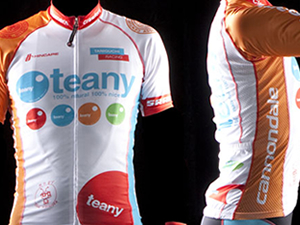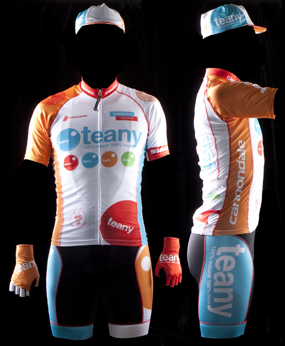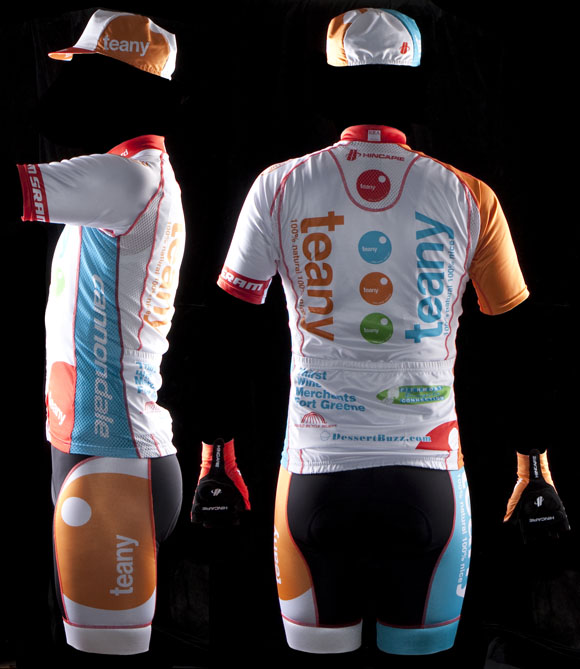
Team: Teany
Designer: Dan Schmalz


From the King of Style™
To me the Teany kit is the amalgamated love-child of a Jelly Belly kit and a BH-Garneau kit. Not knowing the order of operations here, however, perhaps BH is the love-child of JB and Teany, but not JB the sweet biproduct of BH-G and Teany, because JB is establishing itself as a stalwart team to domestic cycling being around for an impressively ever growing number of years.
I digress. Let’s talk style. Or the lack thereof.
I’ve discussed this kit with King of Style and he and I have come to the conclusion that… blaaaaah. Where’s the panache, where’s the flair, where’s the—dare I say it—sex factor? A white kit with a handful of circles and blocks of pastel hues does not constitute the action that I demand in my cycling jerseys. Lackluster and unimaginative are two words that pop to mind when this image first popped up on my computer screen. Those and candy; for some reason this kit just looks like it belongs in on a bumbling giant puppet touting a candy shop, but that could be due to the visual association I make to Jelly Belly, which is a kit that does please mine eyes.
I try to remain firmly objective in my style analysis—since style is fact and therefore proven and not open to wishy washy opinion—I therefore generally do not welcome the actual sponsors themselves into my dissection. However, speaking of candy, my hawk like eyes could not escape the DessertBuzz.com ad on the jersey’s rear. The KoS™ possesses something of a sweet tooth, so with a quick visit over to said website this marginal kit jumped up one rung on my style ladder to just boring (up from terribly boring). Moreover, after viewing this kit BH-Garneau earned a half point increase in all scores, ex post facto.
Final score.
Execution of final product: B-
Effort in design: C
Participation: C+
Designer Comments:
After reading this critique from the King of Style™, I was struck by his hostility towards—candy. He’s ok with desserts, but candy (especially jelly beans) really seems to draw his ire. I may not know much, but I can unequivocally state that—without jelly beans—an Easter basket is just a pile of revolting Peeps gluing your eggs into an omelette of disappoint.
Confectionary musings aside, I am the designer of the kit in question here, and as a designer, I am used to being evaluated. Mr King’s criticisms are matters of taste and preference—which are very personal and subjective—thankfully he doesn’t take me to task for efficacy or a lack of clarity in communication; two cardinal sins for a designer. The Teany identity is well established, and as a designer sometimes my job is to get out of the way and run with the football of an established identity.
That being said, I like the Teany kit very much, as I try to not design things I despise. I can also accept the criticisms from the KoS™, but his attacks on candy I cannot abide.
Who we are.
Dan Schmalz, when he’s not typing aimlessly on the internet for free, is a graphic designer who has owned his own firm for over a decade. His work has been published in numerous national design publications, and his work has received several national awards.
Ted King is still a pro-ass bike racer who rides for the Cervelo Test Team, he also comments upon sartorial cycling issues under the moniker "The King of Style."
If you want to have you team’s kit put through the fashion critique wringer, drop us a line, and we will try to be gentle.
Additional kit reviews

but kos(tm) is off on this one…well designed kit
i like the kit a lot
the design itself seems pretty standard, but the pastel colors do it in.
Is it only me or does anyone else agree thay Hincapie places the rear logo panel on the bib shorts too high. That panel is totally obstructed on the Teany model. Otherwise, the “velocity” line by Hincapie was a nice upgrade over prior years offerings.
?
or that the back panel is supposed to be seen when the rider is in a seated riding position rather than a standing position.
Absolutely true, but even in the riding position the rear logo panel is obscured. Last season there is no doubt Hincapie cut the jerseys too long. This season, the new jerseys are not as long, so I am inclined to think it has more to do with the placement of the logos on the shorts. Not a design issue with the kit, more with how the Hincapie bibs are cut.
unoriginal design, horrible colors, makes male model look like he has small penis
I think KoS has lost his touch. This is among the best looking local kits and it ties in with the sponsor’s branding perfectly.
that’s a guy?
excitable cat 4 comment of the year. bravo.
most people think that tight spandex kits aren’t exactly manly, if you know what I mean. A few, (like Cervelo Test Team kits especially) manage to actually look pretty tough.
this one does not, and it’s down to the colors. pastel does not belong on a sports uniform, I don’t care if it fits with the sponsors’ branding.
Moby would disagree
Truth time.
No matter how manly you think your cervelo test team kit or any other kit is, nobody outside of cycling thinks it’s very tough. You need to understand that the hot woman in the car at the red light isn’t checking out your shaved legs and lycra clad chamois diaper ass. She thinks you look like a dork. Because you do. We all do. Embrace it.
Is this kit for a female cycling team?
i’m also thinking, damn, that IS teany.
So, Locknut,
by your logic we should strive do design the most effeminate kits possible…light purple? chiffon? now that would be a success!
I prefer mauve.
did i read something wrong? it comes off as schmalz designed that kit(?)
ahh, he did. i suppose i should read more than skim before posting. nevertheless, why in the world would anyone let schmalz design their kit after that wreck of a design the BH/Garneau guys are wearing?
I think Dan did a great job. Our riders get stopped by on the streets of Manhattan(and Brooklyn)a lot(and more often by very attractive women), in the park and at races and get lots of compliments – both about Teany, our sponsor and the kits. And it stands out when we are racing.
So if you don’t like the kits, or the model, sorry, but it does the job for our team, and that’s what counts, yes?
no, it’s not what counts. what counts is that we have something to talk shit about. like the model’s incredibly small penis, and the lame kit.
yawn and zzzzzzzzzzzz.