
 From the King of Style™
From a state as vociferously resplendent as to have its license plates proclaim, “Live Free or Die”, the King of Style™ believes firmly in impactful and pronounced fashion, especially whence on la bici. (To bring the historically uninclined up to speed, LFoD is the brazen motto from the granite state of New Hampshire.)
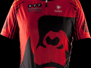
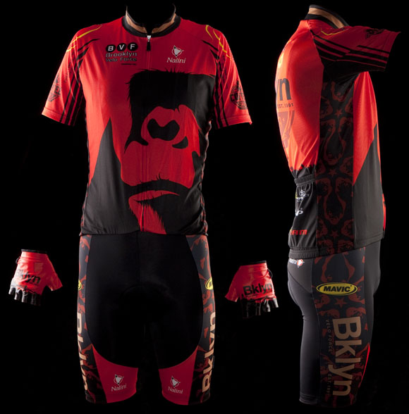
Bold is beautiful and so is this kit – bold, that is, not necessarily beautiful. The critical part of any cycling kit is the jersey, yes? The Gorilla Brand kit cleaves abruptly from de rigueur cycling fashion and places a massive shadowed mammal on the front of their jersey; that much is obvious. Perhaps less obvious is that that is badass and scores highly simply for its aggressive nature. Yet, I don’t necessarily recommend this practice; Team Opossum, for example likely won’t have the same appeal.
I must intercede further critique by proclaiming that I generally try not to let the actual sponsor behind the sponsor invade upon my objective style analysis. However as any New Hampshirite worth his salt knows, perusing BrooklynPaper.com is an instrumental part of each and every morning. Therefore it was virtually impossible to miss this story some weeks ago. While typically the rich and unctuous aroma of coffee wafts from Gorilla Coffee Co.’s front door, on this insidious day it emitted solely the mephitic odor of treachery.
A coffee-block is one thing, but to coffee-block patrons of a shop that sponsors a cycling team?! Well, that simply defies comprehension. Besides the hundreds of other coffee shops throughout New York City, where, I ask, will Joao and his shorn leg Brooklynite cronies go to acquire their coffee fix?
I stray off point, back to the kit.
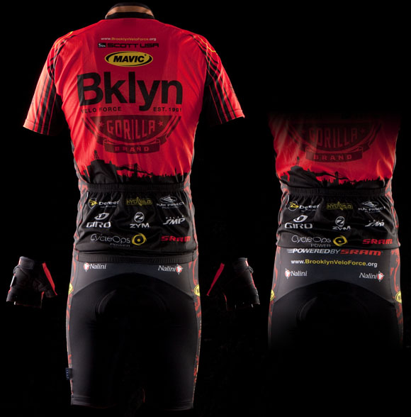
The back of the jersey also scores styles points. Sticking with the tough-guy theme of Brooklyn, the letters BKLYN apparently teamed up and cast both their rotund vowel companions and the letter R aside leaving only what you see there. Again, from a style perspective, in this case it simply works. Conversely, as great of a squad as it is, Crvl Tsttm simply wouldn’t fly. Additionally, the silhouetted Brooklyn skyline towards the bum of this jersey is a winning choice.
Detracting heavily from the kit, though, are the shorts. They’re just drab and lack any sort of imagination. The hindquarters, the crotch, or even beneath the “Bklyn” along the legs leave plenty of room for some adventure in design as equally bold as the jersey’s front. The lack thereof is considerable shame.
Using strictly orange and black is a presumptuous move, but thankfully the former ranks highly among my favorite colors and therefore this brash choice once again is a success.
With an already verbose critique before you already, without further ado, I present the scores.
Effort in design: A-


Ability to Elicit Audience Participation: A

Execution of final product: B
Schmalz Comments
In the world of graphic design (a world in which I am both a citizen and viscount), there are many ways a designer can draw attention to what they deem is important. Manipulation of scale (making things really big or really small) is a tried and true method of capturing a viewer’s attention. In fact, there’s an old art school saying that goes, "If you can’t make it good, make it big, and if you can’t make it big, cover it in neon orange spray paint." Of, course that’s not a hard and fast rule—because I think it may have originated from the guys in the school who enjoyed being in a room full of paint fumes—and I’m not saying that the Gorilla coffee kit suffers from being bad or being covered in paint fumes, what I’m saying is… Well, I’ve lost my train of thought, perhaps that’s a result of too many fume-filled endeavors.
To use the most hackish nomenclature possible, there’s a 400 pound gorilla on this jersey—you can’t miss it—it’s on the front. It’s a very large usage of the Gorilla Coffee logo, which is a fine example of the use of scale to gain attention. This is where things get complicated, while I applaud using large imagery, I feel that in this case the gorilla face might be a little too large. It straddles the fine line between identifiable simian visage and random assemblage of large black shapes, which is not good. Complicating this situation is the fact that the face is on a jersey which is also on a person—people are never very good canvasses, they have bumps and curves and crevasses which serves to distort graphic imagery that’s placed upon them—stupid un-flat people! Further complicating the recognition of the gorilla face is the fact that it’s on the front of the jersey. Cyclists when they are riding, are generally hunched over their machines (well, except for recumbent riders, who are, in essence, in a reclined position with their genitals skyward). This hunching serves to obscure most of the front panels of any jersey except for the top areas on the shoulders. In the Gorilla Coffee jersey’s case, this means the gorilla face will only be visible when the riders are standing up and facing you. I have to wonder if the jerseys might have been better had the gorilla been moved to the back of the kit, and as I am a hack, it would’ve offered me the opportunity to tell every Gorilla Coffee rider that I came across that they "have a monkey on their back".
In summation, this is a nice jersey design, but I would’ve relished the "monkey on your back" opportunity.
Who we are.
Dan Schmalz, when he’s not typing aimlessly on the internet for free, is a graphic designer who has owned his own firm for over a decade. His work has been published in numerous national design publications, and his work has received several national awards.
Ted King is still a pro-ass bike racer who rides for the Cervelo Test Team, he also comments upon sartorial cycling issues under the moniker "The King of Style."
If you want to have you team’s kit put through the fashion critique wringer, drop us a line, and we will try to be gentle.
Additional kit reviews

a banana printed strategically across the crotch area would have been a nice touch
It looks like a combination of adidas soccer jersey and primal wear gone wrong. Don’t like it at all. I like the old yellow one much better.
Kit looks good, pictures kind of suck, model is crooked? Or was he dancing for the photographer?
ugh
Can we talk about the local racing,whats up with all the crashes in the masters field at Prospect on saturday, and how about ” The Badger” atacking from the gun in 95 degree heat at Naugatuck on sunday with two others and winning the race !
i like it. eye-catching and distinctive without being loud.
you guys should do a TdF kit review special. i think most of them suck. here, i’ll help.
like: FDJ, AG2R, Sky
eh + : BMC, Saxo, Cervelo, Liquigas, Quickstep
eh : The Shack, Columbia, Lampre, Caisse d’Epargne
eh – : BBox, Milram, Garmin, Lotto
gross: Katusha, Astana, Euskaltel (mostly because of the orange ass panel)
appalling: Footon
on the local racing topic, i do not understand why people are crashing at floyd.
Greg Avon, said that it was riders taking risk,at Prospect.
Which is true and simply put. I would add,that before someone takes that risk that they think about the cost of repairs to their bike and bodily damage to themselves.
the dorkiest
ted king has absolutely no fashion style…. good thing you’re paid to ride bikes…
Model had one shoulder about 2″ lower than the other, we tried to even him out.
this kit reminds me of footon.
jonas, no chance of printing any thing that even insinuates that this is a male gorilla. the gorilla ladies are decidedly not into that, though one of them seems to act like a real di.k
Nice Kit. Need a bit more yellow.
BTW – worst prokit = AG2R. Are those bibs brown. for 2 seasons I have been trying to figure this out and b/c noone buys or sells the kit I just dont know. Any team kit with brown bibs gets an F.
i preferred last years Bklyn kit, it was one of the best. on the fence over the use of the gorilla face, but over all pretty nice. short of riding for a beer company, having a coffee sponsor ain’t bad, and neither is gorilla coffee.
Yuck
Worse than Sanka
Team Fugly Kit presented by Jane Goodall
Major Taylor dude and someone in a kit i didn’t recognize start arguing and them bumping each other (!)…thinking, this will not end well and sure enough they went down hard.
Gabin: If you saw the arguing/bumping, you should contact Maurice Charles, who was the Chief Ref. He was looking into the incident and would probably want your input.
The kit seems a little too dark and subdued. Not something to catch the eye. I had to look up Gorilla Coffee to figure out the front graphic. I still have trouble seeing the gorilla but that’s because, for me at least, it’s dominated by an alternative Capellan warrior graphic.
http://en.wikipedia.org/wiki/File:STFridaysChild.jpg
The Problem with the kit which schmalz an king are missing is Gorilla Coffee designed the kit themselves and if you have been to their shop you will see it is branded the same as everything they do. Meaning they took the art from the coffee bags, web site, mugs and put it on a cycling kit.
the model or mannequin is failing to fill it out. That can’t help the grading curve. Agree with the point about the gorilla starting to look like big inkblots. Concept is great. Execution is almost good. Like the subtly patterned side panels no one mentioned.
actually the Major Taylor guy won a prime but was DQd because he jumped back in after missing a lap…so the official knew about it. Saw an ambulance attending the other guy a couple of laps later
Just looking at those colors gives me a caffeine jolt. The colors are too loud. Red and black do not compliment each other. I think even Big Foot might get scared of those colors should he come across them in the jungle.
Can we instead guess who the model is?
grande crappacino
“The kit seems a little too dark and subdued.”
“The colors are too loud.”
This just proves that opinions are like a$$holes, everyone has one.
Cool looking kit and the team is super solid, but the Managers of Gorilla really are the worst. I refuse to give them my business anymore.
Matteo Chaindouche
It appears you are speaking through your asshole.
Fart – This looks like and Adidas design gone wrong, just my opinion.
Rating one thing but who would actually buy it and wear it?
I pass.
BVF had one of the best jerseys of the NYC peloton (is there a NYC peloton?)
This one blows, bring back the yellow!!
TOUCH MY MONKEY!
http://www.youtube.com/watch?v=Ay6N33y_UG4
No way Svein Rucker. BH’s half rainbow kits were and are the best. No monkey business, just bright and colorful. Yay BH.
AG2R the ugliest pro kit? No way. That dubious distinction must be given to the “footprint in shit” stylings of the Footon-Servetto team.
http://www.lequipe.fr/Cyclisme/20100112_003633_le-pied-pour-les-jeunes.html
I like the ag2r kit, that footon kit is shit!!!
When I heard that this kit was in the works I got excited because I am a huge fan of the web site design. This kit falls short. Sorry. Check out: http://gorillacoffee.com/
check out this one’s moves!!http://www.youtube.com/watch?v=4hjTlQahSjU
Wait until the hairy armwarmers arrive.
Ok….This kit has the start of something cool. Right now it needs a little more massage – particularly the front jersey. The rear jersey – diggin the layout with the br.bridge figure ground ala katusha. Wish this graphic were a bit bigger but still looks good. The front jersey – looks unfinished. Maybe smaller Gorilla head larger BVF -or- whatever that graphic is on the sidepanel should be on the front with the stars explored a bit more. The bib front – Looks good. Bib back – design cop out – missed opportunity. It gets it done but looks phoned in. all in all this kit will probably look great in 2012. The 2011 kit is worthy and for the most part is good for the freshman outing.
By photographing this kit on a black background, it looks as though the riders crotch has disappeared into the void of doom, and his disembodied torso and legs are hanging by a thread… the hands… they are lost forever.
Love it love it love
Brooklyn thug in da house.
Yo Yo Yo whadda up dog.
Love dat ghetto look on this kit, love it yo.
if you stare at the front of this kit long enough, you’ll see snuffaluffagus reaching over a peeing witch to grab a crab leg…
Really think it is a cool set up, and love the colors. Living now in Florida and still racing at the master level and surely would love to have a kit like this in a race in Florida. Ex-New Yorker, born in Brooklyn; East New York Area. E-mail….thetrek1@tampabay.rr.com.
I am personally impressed that Schmaltz has a real business, is a success in his trade and does not live in his parents basement. This goes a long way with me, for when the question is asked of a blogger: did he “pick up his Moms knee highs before his entry ?” most of the time the conversation all seems to go south….
not with Schmaltz…bravo
Available to us mere mortals?