Section head text.
Time to pay the pipers, suckers! You know you’ve been taking the shots of yourself from our site and ink jetting little shrines to your own awesomeness! And don’t get us started on the proliferation of cat humping dogs on myspace.
So, show us some love next year and put our logo on your kits! We will make one of many logos available for reproduction. We prefer a placement anywhere near the crotch.
Share the joy of choosing a pronunciation for the site.
Click on either logo for the eps file.

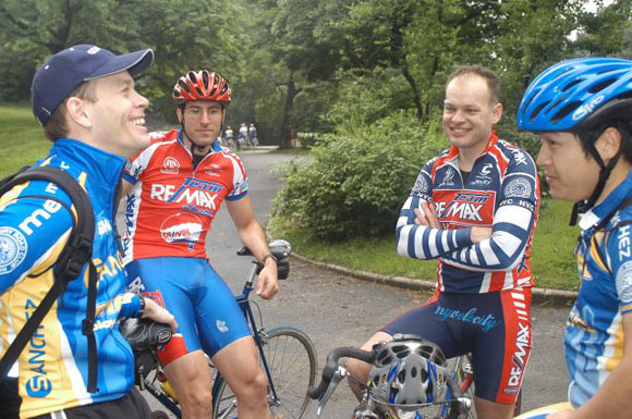
Schmalz revels in a proper placement, and mentally vomits.


You guys are sick in the head. But I still love this site!
that’s not funny!
I don’t have a comment on the logo, but wish this site was less graphically intense. I don’t often have a super-fast internet connection and it’s sometimes very hard to get around. If you ever do a re-design, keep the ads to pay the bills, keep the photos but please please reduce some of the other images.
Is Schmalz going back to Sanchez? At least he’ll get his more manly kit back! It’s much more becoming.
I was planning an explosioni, that way we get away from each other instead of being smashed together.
siega looks fat and mihael is bald. I’m glad i left ReMax.
Testing. Sorry.
Testing. Sorry.