Team: Kingpin Racing
Designer: David Richman


Comments from the King of Style™
The Internet Movie Data Base, or IMDB, is the quintessential website to endlessly scour information related to movies. From synopses, to awards, to an arbitrary fan-based rating system, this site has it all. The Big Lebowski, for example, scored an undeservedly low 8.2 out of ten. Ten out of ten would be more justified and if you disagree, then (Donny) you’re out of your element!
In a startling coincidence Team Kingpin kit has netted a KoS™ score of 8.2 out of ten. Let’s pore over why.
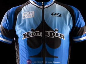
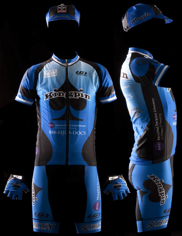
At the pinnacle of the sport, the foundation of current cycling fashion reckons the yin to black’s yang is red—Cervelo TestTeam, RadioShack, Caisse d’Epargne, and BMC all subscribe to this teaching in spades. Kingpin’s black and blue bifurcation from the cycling pro-dom is a bold initiative, for me however, nothing really pops from the kit. This could be a result of a fairly dark kit modeled in front of a pitch-black background. In any event, absent from Kingpin’s marriage of black and blue is the je ne sais quoi that shouts, “Hello world, I am here! Pay attention to my fashionable yet protective eyewear, my freshly shorn legs, and meticulously maintained tan lines.”
From here I delve deeper into the significance of this color scheme. We unanimously agree that The Dude was not the most driven individual by societal standards, so perhaps in parallel fashion a divergence from the cycling industry standard of looking super-pro was this designer’s objective. Ergo, besides that it’s illegal and not including that it’s on WADA’s list of prohibited substances, it would be appropriately Big Lebowski’esque were the designer to have been toking some Mary J and searching for something a little more ethereal while conceiving this kit.
To further cementing this notion is the title sponsor: NYU Hospital for Joint Diseases. JOINT diseases, Dude. Need I continue down this path? Nay.
Moving on, one glaring detractor on the front of the jersey is the centrally located phone number, as the zipper renders it indecipherable. One could probably conjecture the correct nebulous digit, but the damage has been done. This ten-digit sequence is of utmost importance as it literally puts the number into the advertisement-recipient’s hands while he or she is dialing the sponsor. One recommended alternative is the dangerous tool of kit asymmetry. Although used sparingly, when executed with deft designer artistry, the results can be stunning.
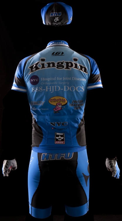
Another factor that raises questions is the placement of HTFU. Being that it is located on the wearer’s caboose, one should assume this message is being conveyed from the person donning the kit to the reader/rider lagging behind. However, this defies logic as this message will inspire the rider being dropped to indeed Harden The F*@k Up, summon superhuman strength, catch and pass the Kingpin rider, and presumably win the race. Simply put, this message inspires the wrong rider! A more advantageous alternate location for HTFU would be on the tops of one’s gloves, so that the Kingpin rider can receive swear-word inspiration while he (or she) is gnawing on his (or her) handlebars while arduously holding the wheel in front of him (…or her). Just an idea (…and a brilliant one at that).
I jump from one accessory, gloves, to the next, cycling cap. While I sincerely don’t mean to continue knit picking, these critiques are anything but trivial and must be addressed, albeit briefly. I just wonder if Louis Garneau himself, the sponsor who created the jersey and shorts, is aware that his cap advertises for a direct clothing competitor in Champion Systems?
It may be the case, however, that this decision was intentional as the Champion Systems logo is placed directly below another stark order from Louis Garneau to HTFU. Hence, just like a pair of cyclists, it is time for the conflicting sponsors to start attacking each other. If that was the designer’s intent, then I applaud the decision for bringing a little bit of grit and excitement to the game. If not – and I fear that Mr. Garneau would not be pleased to witness such hostile sponsor incongruity – then perhaps a battle of cycling nerds is exactly what would resolve such an issue.
Without further ado, the scores.
Effort in design: B+

Ability to Elicit Audience Participation: B- 

Execution of final product: B
Again, Kingpin bowls a respectably strong 8.2 out of ten.
Schmalz Comments
This is another somber kit, after last week’s mostly black ensemble, we are confronted with another exploration into the deeper shades of the color wheel. I’m not sure whether there was a conference between team designers (which I missed—are you people dodging me?) or whether this is a manifestation of the collective unconscious at work (a phenomenon which I also blame for both skinny jeans and the career of Justin Bieber); but the result is the same—there’s a lot of BIV colors from the ROYGBIV being put to templates and thrust out onto the roads of the area
This brings about a tactical complication for these teams that have embraced the dark side. Dark colors are fine if you are a somber teen and need to show the world that you indeed have deeps thoughts and will even dare to take black and white photographs of your girlfriend (who’s really your cousin because you don’t have a girlfriend) in a cemetery; but like that teen who goes too far and reaches for the bottle of guy-liner, the darkness can be taken too far. This kit looks very nice when you are close to it, but in a race situation (especially with the legions of funereally dressed racing along with you) it will be very hard to distinguish who’s who at the front of the race, as they will all look like bobbing charcoal briquettes.
But this is a fine kit, and I enjoy the bowling/Lebowski inspiration. One criticism I have concerns the figure enhancing black shapes on the sides in the front and back; while accomplishing their silhouette enhancing job from the front and side—once they combine on the side (and that’s the panel most people on the side of the road see when cyclist whoosh past) they form the shape of a distorted mandolin—and no self-respecting teen nihilist would be caught dead with a mandolin.
Who we are.
Dan Schmalz, when he’s not typing aimlessly on the internet for free, is a graphic designer who has owned his own firm for over a decade. His work has been published in numerous national design publications, and his work has received several national awards.
Ted King is still a pro-ass bike racer who rides for the Cervelo Test Team, he also comments upon sartorial cycling issues under the moniker "The King of Style."
If you want to have you team’s kit put through the fashion critique wringer, drop us a line, and we will try to be gentle.
Additional kit reviews

htfu on the gloves. makes so much sense.
good design, great looking kit. really defines “bowling league in spandex.”
I agree on the round shapes in the love-handle (or man-handle) area. A straighter silhouette (sp?) would’ve better. Were they going for a black bowling pin shape and missed the “pocket”?
Also, maybe instead of the HTFU, they could’ve gone with a WWWD, to fit in with the Dude/ bowling motif.
This kit is lame.
second only to your critique
This site is lame
so why are they called kingpin? do they knock down fellow racers like so many pins on a bowling alley? or is it “just a name.”
Well lets see:
1. Design : B, they gave it the good-old college try
2. Color : C, different but its not as good as a blue kit should, whats with the fade? Didn’t that expire in Design?
3. Sponsor Logos : F, first the washed out Hope Valley. Then the tiny side jersey sponsors. HTFU, I don’t know what the HT is but we all know what the FU is, bad logo location. OrthoChick, looks like a old man’s head cartooned on a chick-en. How does Kingpin and a spade relate? Sponsor logo? Bowling pin would of gone better with it if it is bowling related
3. Other : D, Blue-White sleeve stripe, did the team win the blue white jersey some years ago? Kinda PezCycling looking artifact actually.
4. ?
I think had they added thin white lines between the color changes might of made some good transitions between the boring colors, those colors are drab. Well is there some race pics with it for a more realistic view of them? Even if its at 5am when you crazy’s race.
Overall: D++, they’re just missing that little extra to better utilize the Kingpin name.
well, WE all know what it means, but you don’t seem to
Are there different dummies you use for this series as the FGX one seemed bigger than this one….
HTFU….
Hopelessly Training Future Underachievers?
Huge Tushies Fart Uproariously?
Helps Treat Frequent Urination?
Is it opened up yet?
Item #3 – The ‘washed out’ Hope Valley logo actually reads Hope for Haley. It was a late addition to the kit in support of a 5th grade girl in my twins’ school who had her entire right leg amputated this Winter due to osteosarcoma. The prosthetic bill alone, until she reaches her full height, will be upwards of $100,000. Our team has made a donation to her foundation and if you’d like to step out from behind your anonymity feel free to contact me at mrgatens@gmail.com to make a donation.
Is there a paypal option for that Brian?
please
ted king is hilarious.
Moved to Off Topic
Ha! I just read the Ted-Dan review (didn’t read it before reviewing it myself). You guys were on the side of nice, but then again you see those guys.
I just remembered, maybe having the sponsor logo’s not easily distinguishable is a good thing, as it keeps anyone annoyed by our antics on the road from identifying them and calling to complain about our super nice and legal riding tactics. Not that anyone has ever called one of the sponsors on my jersey for that, never, cough, cough…
Clear violation of the sub-team policy.