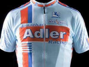
Team: Jonathan Adler Racing
From the KoS™
An orange and blue kit is perfectly fitting for a mid-Giro scribed King of Style kit critique as this year’s tour of Italy began in Amsterdam where orange and blue are as ubiquitous as tanlines are to a mid-July peloton. I seem to find a shortage of time dedicated to critiquing cycling clothing from the big apple, however, whereas I’m finding myself spending significantly more time bike racing and stuff. Grand Tours have that effect.
Without further ado, let’s get straight to business.
Jonathan Adler… never heard of him. But I like his cyclist-like vain approach of naming a team after himself. As a matter of fact, an iamTedKing kit is in the works, so while you wait with bated breath for the i.a.T.K. kit release, I reward his vanity with several kudos and one and a half stars of approval.
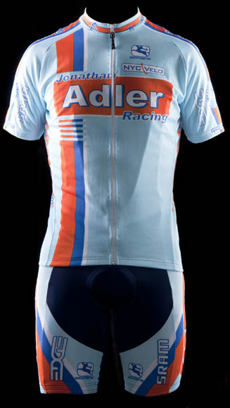
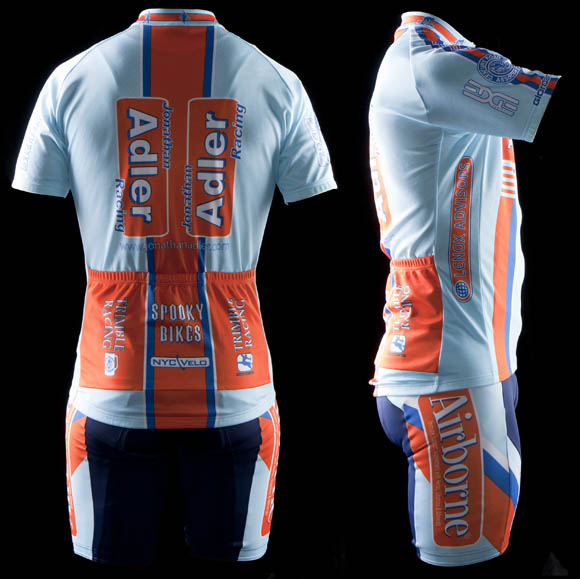
The front of this kit looks like a bottle or box of over the counter pharmaceuticals. Perhaps that was the goal as Airborne is such a product and is a prominent leg sponsor. And let’s be honest, the best location for a sponsor on a kit is the leg, since the strength of one’s legs must speak for themselves whether in a race or pumping your friends in a town line sprint. Clearly when a Jonathan Adler team rider (side question of my personal curiosity: is there anyone else on the team besides Jon?) wins anything, it’s thanks to his cylindrical tube of vitamin and mineral effervescents. Clearly.
Whereas the front of the jersey is clean, well organized, and deftly utilizes asymmetry, I find the rear too cluttered for my taste. This could be attributable to the vertical rather than horizontal sponsor placements. Negative four points for making me turn my head.
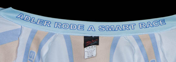
Lastly, the collar inscription: not a fan. What if Jon didn’t ride a smart race? What if he wasn’t racing at all but merely out for a casual coffee shop ride? Yeah, then what?! A pair of more fitting alternatives could be something more along the lines of, "Jonathan may have ridden his bicycle today" or "Jonathan spells his name without an ‘H’". These are both true and therefore applicable, as the last thing a collar inscription should be is a lie.
Effort in design: A-
Ability to Elicit Audience Participation: A (everyone now wonders, Who is Jonathan Adler?)
Execution of final product: B+
Schmalz comments
Ted King is (I will say it again) a pro-ass bike racer and that takes up a lot of time. He’s busy riding, eating, getting his body parts rubbed and finding a reliable Italian translation for Chunky Monkey. So I do not blame him when he knows not of Jonathan Adler (chic home accessory designer), as Mr King’s present home is—like a metal band that does the county fair circuit or an interstate trucker—the road; and he has no need for chic home accessories. I also do not blame him for not recognizing the one of the most famous liveries (livery is the car racing term for "paint") in automobile racing, as Ted King is, I reiterate, a pro-ass bike racer, not a pro-ass car racer.
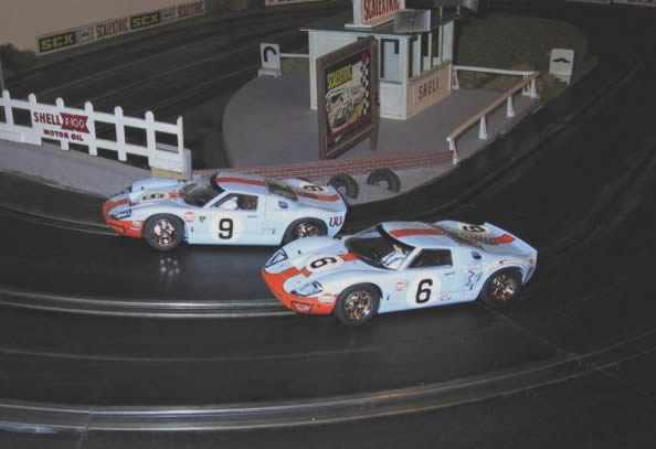
The GT40 in slot car format, only really famous cars like Porsches and the General Lee get made into slot cars.
The Gulf livery that the Adler kit is based on is one of the most iconic in motor sports, as it was the orange and light blue colors of the famed Ford GT40, a car which was not only fast but also an automotive middle finger to Ferrari. Therefore the Adler kit is basically a sponsor tribute to another sponsor, a marketing version of Escher’s steps if you will. While the Gulf colors are a fine combination when put upon the graceful lines of the GT40, the colors can sometime go awry when placed in other contexts, like the following.
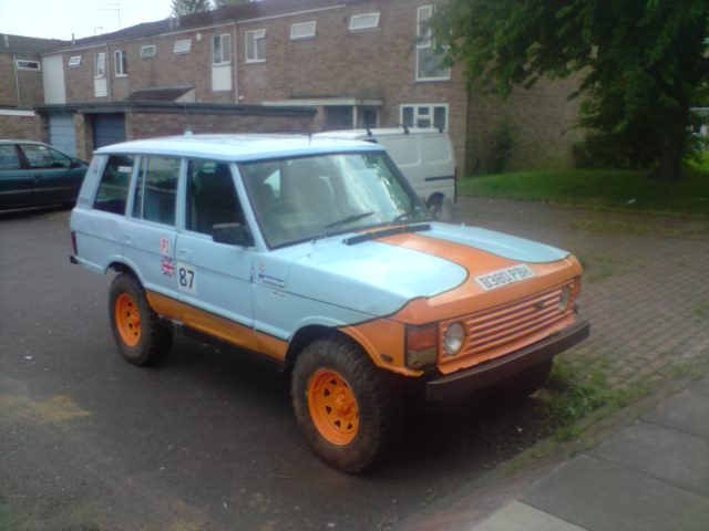
The key to proper off road latte acquisition is the appearance of speed.
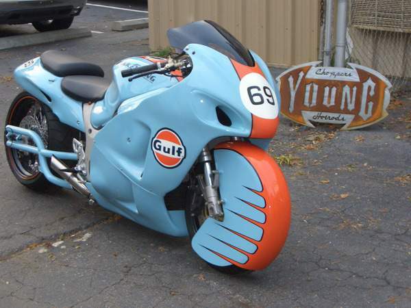
The number 69 is clever in any context, even Jonathan Alder has to agree with that.
The decision to base your team’s kit on the livery of a racing car is a complicated one to be sure, and I have to wonder if they went through a selection process, for instance, did they consider a Porsche "Hippie 917" ensemble?
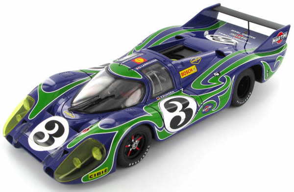
Groovy and slimming at the same time.
Or perhaps even the 917 "Pink Pig"?
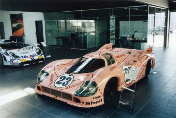
This would show those cowards at Footon!
But by whatever means Adler decided upon using an automotive theme, I think the kit is very distinctive. And I will have to add that Adler raced a smart selection process, as I’ve heard that the following second place vote getter in the team kit caucus.
Who we are.
Dan Schmalz, when he’s not typing aimlessly on the internet for free, is a graphic designer who has owned his own firm for over a decade. His work has been published in numerous national design publications, and his work has received several national awards.
Ted King is still a pro-ass bike racer who rides for the Cervelo Test Team, he also comments upon sartorial cycling issues under the moniker "The King of Style." He is at the terrifically pro Giro RIGHT NOW.
If you want to have you team’s kit put through the fashion critique wringer, drop us a line, and we will try to be gentle.
Additional kit reviews

“Adler rode a smart race.”
Classic. Well done, boys.
(Someone get iaTK to sit down with B. Historicus asap to get him up to speed.)
that the adler team kit rocks! has for the last 3 years. best looking kit kit in the crca. can i join?
i’m starting a KitWatch “who’s the model” pool. send me your money.
nice kit, but i preferred the first iteration with the more direct gulf reference
this would have been so much better if ted king knew who jonathan adler was.
That model looks like the guy from Godzilla.
who or what is spooky bikes?
kit watch and schmalz’s race reports are the best thing on this site by far.
I’d put my money on Cutty.
What about: Adler packed a tight bowl
Schmalz isn’t a pro-ass bike racer, he’s not too busy riding, eating, getting is body parts rubbed (by others), and can read Chunky Monkey in its native language and knows who Adler is in too much detail.
Yet no review?
not me. i’m so fat.
Can’t be Cuttler. The buldge would be bigger.
Spooky is a bad ass Northhampton, Mass boutique frame builder.
dude, i take dumps larger than you
Ken Harris
But I did like the first year version better.
label on the kit looks to say size “s”. Ken is certainly a large.
The kit’s not bad when compared to other kits. But, if this Jonathan Adler is indeed the designer Jonathan Adler, then I can’t help but expect better. If nothing else, I would expect better typography.
i don’t think Jonathan Adler himself has been a sponsor since the first year the team existed. The team has taken on a life of its own. Good team though, nice kit.
Whatever happened to their Fanta/Proasshit.dk spinoff? that was cool.
Jonathan himself actually submitted a design included decorative pottery and throw pillow graphics along with a chihuahua insignia. He also went a bit too crazy with the pink and mauve hues.
The kit you see was first designed by Adler emeritus Mo Ragaza in 2005 when we launched and has been updated a bit each season since.
Mo is a clothing designer for Polo Ralph Lauren and the team is extremely thankful for his effort all these years.
Do you guys get discounts on the leather animals?
http://www.jonathanadler.com/product.php?productid=17446&cat=500&page=1&initial=
Of course everyone liked the first years version better. That was a direct ripoff, or tribute, to the Gulf racing team. I especially liked the mechanics jumpsuits worn by some of the team members.
i think he most certainly is a sponsor.
Come on peeps, Adler and Airborne are portfolio companies of GF Capital. The question you need to ask yourself is why the association with the team in the first place. And the answer is . . . obviously.
robin, do tell, why exactly did you think he was not a sponsor?
Is it more appropriate to say Spooky is a boo-tique framebuilder?
jersey is set too low in the picture. no view of the rear shorts panel.
is it the same “model” for all the kit watch portfolios? or all of the kit models suffer from a sagging ass.
can we get victoria’s secret models to showcase the kits, please?
Surely you mean Spooky is a boo-tique framebuilder.
isn’t johnathan adler a huge flamer?
who cares in way whatsoever?
are you on a team from the taliban?
or worse the 700 Club?
i care because it obviously bothers you, and bothering you gives me great pleasure. besides, why did you take it as offensive? why the knee jerk assumption of negativity–to the point you couldn’t even come up with proper grammar? gay guys call each other “flamer”, “fag” as terms of endearment and empowerment. and if you’re going to be such a maggot about why anything matters, why the hate on the 700 club? only slightly hypocritical. so, you are an asshole. and there is something wrong with that.
this is cycling right?
whatevah???
as i remember (vaguely) one of the original members of the team worked for the company but doesn’t any more. maybe i’m wrong about that. anyway if a team has a strong identity and is a good team why not keep it going? sponsorship doesn’t mean all that much at the amateur level anyway.
Founding member (JA likes when I say member) jay fitzgerald aka “Hater” was the president of Jonathan Adler when the team started.
speaking of members…http://www.telspatch.co.uk/jokes_and_one_liners/funny_text/ftext_w/why_cycle_shorts/red_shorts.jpg
Next on Bravo: Men Who Shave Their Legs and Wear Tight Lycra Clothing and Hang Out and Sweat and Ride Bikes with Similar Other Men, Yet Who Question the Sexuality of Others.
two words. christopher chaput.
Wait, so you’re saying Chaput is gay? I’m so confused…
god i wish chaput was gay
If Chaput wasn’t straight, he’d be gay.
deleted
everyone on this website needs to stfu and ride your fucking bike. When you actually get to the level of Ken Harris, then fucking talk. Your probably that wheelsucker that’s constantly on his wheel every race but can’t hold on.
you need to heed your own advice, and learn to spell.
I type quietly, I don’t talk when I type.
With that theorem I’m not a wheelsucker!
Take that Ken Harris!
That subject has nothing to do with the photo, but it was a funny comment made to a rider in a race once somewhere.
More Gulf photos though
http://www.flickr.com/photos/cmphoto/4634375923/
http://www.flickr.com/photos/cmphoto/4646307220/
Chris Uglietta was actually the creative genius behind the Proasshit.dk. I worked with Chris to do the options for that kit, the Adler kit and also the OVER the TOP Adler “Preppy” kit. Successfully getting away with the “LV” print on the sidepanel and getting someone to actually print that was funny.
Chris had some funny ideas, and had a really good eye. We worked up many versions, but ended up “dialing it back” to something that made more sense.
We worked together on the kits from the start until 2009. The collar was his idea but we kept inside, in case we didn’t ride a smart race. The outer “evolution” was a knock off of some other design, but we added the Cross and Roadie at the end of the Evolution cycle.
I usually offer at least 15-20 color versions of tops/bottoms and I get feedback from Chris/Greg and Ken.
Chris would spin off ideas, Ken would give graphic design feedback, and Greg would specify logo placement suitable for the sponsors. So was a team effort.
I agree the back is a tad busy and needs work to tie in with the simplicity of the front, but we finalized sponsorship late, so was a bit of a rush job to hit deadline so we can have kits by Spring.
I like last years kit the best, with the skinsuit looking pretty sick, but had feedback from the riders that there was just too much blue. Going to have to improve this next year for sure. The orientation of the main logos on the back was a suggestion of Kens for all the “side shot” photos. But these could be made larger and possibly pull the orange out to get more contrast and sponsor visibility.
We knew the Gulf logo was total knock off, so that’s why we tried to do something different. But keep the inspiration from Motorsports. The front inspiration is actually from the Rizza+ Moto GP team. Changed the colors of the stripe and added interruptions in the stripe (taken from a Decente jersey that I had from the 80’s). These stripe interruptions look cool on the l/s skinsuit.
As for local team kits that I think look cool, Die hard has simple clean kit and the former WS United Kits (which I also did, working with Ricky and Burrows in ’08, ’09. Ricky is ex-Army like myself so we worked well together with very little fuss and I probably had the quickest approval time that I’ve ever seen for a kit.
As for best looking kits on the Pro tour. I really like the Cervelo team and Team SKY.
Something about simple black and high contrast, makes these kits look cool.
You can also spot the black kits easy from the Helicopter view.
Can someone summarize that?
Ugli inspire Mo, Mo make kit, Ken/Greg approve kit, Mo ex-military, Mo like other kit of other NYC teams.
Good?
Thanks.