From the King of Style™
 Among the litany of reasons we cyclists are infatuated with our sport is that we can adorn ourselves in strikingly ridiculous attire and publically parade about town. Most of this cycling-inspired clothing is virtually painted on our lithe bodies, which only adds to the absurdity of our costume (let’s not fool ourselves here, it is a costume). Denim bib shorts, an entire closet of kit worn exclusively by Mr. Cipollini, and the Footon-Servetto kit immediately flood to mind. These are three extremes, exhibiting the vast range of our costumed world, but they’re outliers certainly worth mentioning.
To the uninformed non-cycling audience, we look ridiculous all the time. While we awkwardly saunter in line in cleated reverse-high heeled shoes to order our skinny machiattos sweetened only with a half packet of Splenda, a non-cyclist may gratuitously offer, “That’s a very, umm, colorful outfit. Neat!” which immediately elicits commentary in our minds – and hopefully only in our minds – something to the effect of, “Fool! It’s called a kit. A KIT!” However this demographic of hairy legged non-cyclists is not the audience to whom we’re painting ourselves up. Rather, we dress to impress each other.
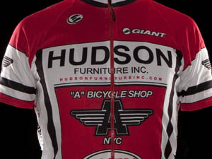
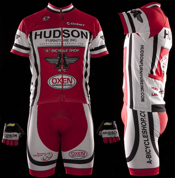
So why, oh why, would someone go to the trouble of designing a kit as abominably bland as this? I would normally say that it’s insipid lack of creativity leaves me speechless, however, I’ve now gone to the length of writing well into my third paragraph about this kit’s unrepentant flair for… vanilla.
Moreover, and down to some nitty gritty, what I have to assume is “NYC” on the front/center is sliced clear in half by a zipper (in fact, probably a ubiquitous YYC brand zipper), thereby leading the uniformed viewer into thinking this is an NC or North Carolina based team. Although in reality perhaps that’s not such a bad thing to separate one’s self from the actual team base so one won’t be accosted for dressing so unimaginatively drab.
The final score.
Effort in design: F, for Freakin’ lackluster.
Ability to Elicit Audience Participation: C. There are websites among the sponsor logos, which in reality will draw me to Oxen when I need my workwear needs accommodated.
Execution of final product: D. Sadly not even a non-cyclist would be inspired to comment on this kit as it passes forgetfully in front of said viewer at the coffee bar line.
Schmalz comments
Templates are good for many things—they are great for banging out exact duplicates of things that need to be made to exacting industrial standards. Gaskets, for example, should be as similar as mechanically possible, because in the gasket world, being indistinguishable is an aspiration, maybe even a virtue. There are endeavors however where being homogeneous isn’t exactly an asset. You wouldn’t want to create the same ensembles for two marchers in the Mermaid Parade—as that would create confusion and most likely a fierce slap fight. Marketing is another undertaking where being indistinct from your competition is a serious blunder (unless, of course you’re Kennedy Fried Chicken, Wiedemann’s beer or any of the pizza places in New York that are named with a combination of the words: Ray’s Pizza or Famous), and I fear that the Hudson kit is a victim of "template thinking".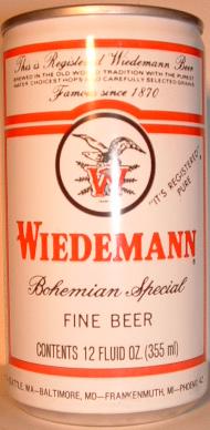
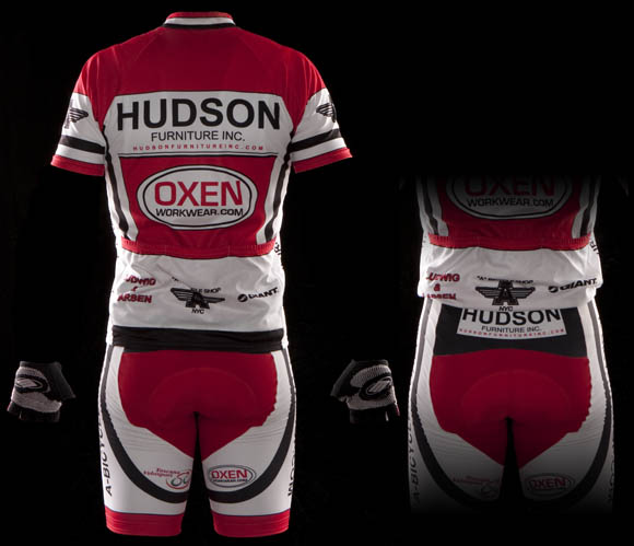
Template thinking is the concept of taking on a design challenge without… a concept. You’re just filling up boxes with stuff, art-wise. It’s the art equivalent of sitting in during a race. It can be a perfectly adequate way to get to the finish line, but no one is going to accuse you of being inspirational. In the case of the Hudson Furniture kit, I feel there’s some template thinking going on. Granted, the main sponsor’s logo is basically the word "Hudson" set in Helvetica (or one of the other indistinguishable members of that redneck Swiss typographic family tree. Yes, I’m talking to you, Arial), but that’s no reason to succumb to the Helvetica vibe for the entire kit design. This design is essentially a white panel on the chest and the back with a red background. It feels like "option C" in the jersey layout selector from the manufacturer’s website.
But don’t think I dislike this kit, it just doesn’t rouse nor arouse me in many ways. I do like the bold striping on the kit, and I will say that red is a daring color for the panel that covers the "region de reproductive". I can say from personal experience that red, whilst a striking choice for crotch coverage, can be terribly immodest in conditions that involve: rain, bright sun, shade, humidity, fog, incandescent or fluorescent light and moonlight. That leaves you with a daily five minute window when the red looks fabulous, so use it wisely.
Who we are.
Dan Schmalz, when he’s not typing aimlessly on the internet for free, is a graphic designer who has owned his own firm for over a decade. His work has been published in numerous national design publications, and his work has received several national awards.
Ted King is still a pro-ass bike racer who rides for the Cervelo Test Team, he also comments upon sartorial cycling issues under the moniker "The King of Style."
If you want to have you team’s kit put through the fashion critique wringer, drop us a line, and we will try to be gentle.
Additional kit reviews

Will never not be funny, in any combination.
That’s a fierce slap of a comment, almost a fight, really.
ouch.
conservative? yes. but it’s clean and the colors don’t fight with each other like a lot of local kits…don’t see why the hate.
Hate? No hate, just apathy really.
Is Verdana really that far ahead of Arial in you hierarchy?
Not particularly, it should be all Brush Script as far as I’m concerned.
http://www.cyclingnews.com/news/photos/mountain-bike-titans-to-battle-at-leadville-100-this-weekend/135466
listen to me, and listen to me well, maria conchita alonso.
“Swiss typographic family tree” my ass. if helvetica and arial were in the same family, i imagine there’d be a lot of drunkenness, ass-whooping, tears, and several very awkward thanksgivings.
you think arial is swiss? bite your tongue, schmalzy! as a reknowned graphical artiste, we’ve come to expect more from you.
go buy this:
http://www.helveticafilm.com/*
and as for indistinguishable, go practic on these**:
http://www.iliveonyourvisits.com/helvetica/#
http://www.ironicsans.com/helvarialquiz/
you are on dangerus ground here … tread carefully.
* also works well as generic version of the drug ambien. do not watch ‘helvetica’ before operating heavy machinery, or at any point in time where you cannot afford to be afflicted with temporary narcolepsy.
** g*d bless the internets. seriously, what the hell did we DO all day before al gore created this freakin’ thing?
Don’t love it, but in a world (tri-state bike scene) where everyone is trying to be creative, to the point of busy and ugly this kit stand out.
Notice how pro kits are better. 1. they know what they are designing, 2. they change the kit several times. The first version is never as good as the later.
To me this kit is refreshing.
I had a feeling someone would comment on the inclusion of Arial in the Helvetica family tree. Arial is, of course Microsoft’s sorry stand-in for Helvetica, and a poor one at that, but there’s no denying that it shares many visual characteristics—probably just enough to not warrant a legal action from the Helvetica people, Microsoft’s sneaky that way.
yeah, i knew you knew you were baiting the crazies!
17 out of 20 on the quiz also, I don’t know my all caps type that well…
I agree with 9:02. The kit may be simple but that makes it stand out amongst the other NYC kits.
First year team with a bunch of nice guys/good riders and a pretty decent kit so the only place to go is up.
This post would be more complete if you displayed one or two proposed alternatives more worthy of the king of style.
This kit looks good. I like it.
the kit got nothing but compliments from everyone I know, It’s simple, stands out in the pack, looks good and feels good when worn, very surprising that all the other kits in the reviews, kits that the riders that wear them hate themselves, got the better end of the stick, which leads me to Ted King, did the self proclaimed king of style ride the cobbles the day he reviewed the kit without a seat, that seatpost must have really got up there pretty deep.
excitable yet anonymous hudson furniture riders: relax. you put the kit up for crit, then – shocker! – it gets critiqued. not really worthy of your creepy quasi-homoerotic insults.
any good routes? don’t tell me to google it, I’m looking for opinions, not dubious software generated shit. go off rain or shine?
agree. you want feedback? you got it.
that said, it’s boring, but it’s not horrible. if the point is not to be boring, then ok, it’s an F, but i would have to take issue with mr. king’s apparent assumption that kits are supposed to either knock it out of the park or fail spectacularly. there are plenty of “safe” kits in the pro peloton, and they arguably look better, on the whole, than the risk-takers.
don’t tell him. reward him for his attitude and make him google it.
right answer, you win. screw all yall
KoS is off on this one — for sponsor exposure and on-bike or ride-by readability (unbeknownst to most, some sponsors may actually give a shit about that), this kit is clean, clear and classic. I’m surprised at the KoS diagnosis, considering his team’s kit consists almost entirely of one letter with accent – for a similar blunt understanding of who’s paying.
Personally, I’ve always felt that the best on-bike sponsor exposure areas are on the sides of the jersey, the shoulders and the legs of the shorts. This jersey treats all of those like afterthoughts.
what about – not being a wise-ass here – the ass? my pops is always saying, “i love those mariella pizza girls.” had no idea what he was talking about for the longest time…
EVO Devinci Kit from 07 – White, great and orange. Really nice French Canadian style. Oh and for some of you old Battenkill die hards, the kit that got Lisbon at the line in the Pro1-2 during his premature celebration. I also love the Cannondale CXworld/.com kit in its lime green and black goodness.
Here’s an example (pulled at random)
http://www.flickr.com/photos/26077740@N04/4872112812/in/set-72157624679640622/
Upon looking at that kit, I would say the name of the team is “East End” as that’s what you see as the rider goes past. Notice how you don’t really see the chest or back panels at all. Too many designers concentrate on the panels that you only see when the riders are standing.
what kind of results have these excitables gotten?
Howza, the rear short panel is very valuable real estate, especially if a person like your father turns his head to see who just went past, and, um, looks towards the rear…
Riding the local races as a 4, I always see the “Hudson’s” racers in the front, actually thought they have a good looking kit.
As a lot of things in life it’s a matter of taste I guess, I think they are easy to spot in the group and the lines are sharp and clean looking…
“While we awkwardly saunter in line in cleated reverse-high healled shoes to order our skinny machiattos sweetened only with a half packet of Splenda . . . ”
Who does this? WTF are you talking about?? “Skinny machiattos?” Thats really lame.
“Next on Bravo: Ted King describes the FAB-U-LOUS NYC cycling scene then talks about his secret life as a gimp”
Second for EVA Devinci,
it stood out in the crowd:
http://veloptimum.net/photos/velo/8/6juin/Beauce/8825BMartelG-EDuquettte600H457.jpg
A Bike Shop gets a prominent location on the shoulders.
http://www.flickr.com/photos/26077740@N04/4871506607/in/set-72157624679640622/
I agree the leg of the shorts seems to have too small a font to get the point across
who are yall kidding, we shave our legs because we are vain sheep. No functional reason, none. what, you don’t risk road rash on arms? you don’t shave them.
wh- … what?
mauro, i could not agree with you more. if you are going to vehemently argue with imaginary posts, however, you may prefer to do that in the privacy of your own mind.
This sport is very rich in tradition – some good some bad. One of those traditions is shaving. Plus it looks pro as shit when you rub in embro.
J
Get to Piermont Road and make a right towards Piermont/Nyack.
They won the overall in the 4’s in Charlie’s PP series!
whoops, was responding to the last post on the FBF 8/10 page asserting that we shave our legs because we crash.
Rockleigh is Canceled.
C’mon. We do it because it looks pro and because it looks good..
what? was gonna be first time. really cancelled? why?
Anyone out there like the pro team kit from Sky? It’s as simple as it gets yet effective. Maybe because we know it’s a pro team why we accept it?
as much as we’ve heckled them, the ralpha kits (like sky) are pretty nice
Very cool. Good luck!
But nothing special…take risks, add some colors. red/white/black…dime a dozen
was particularly hard on the hudson furniture kit- maybe unfairly. ok – it’s rather staid, and maybe even boring, but it doesn’t look bad. i think it’s ok, but it doesn’t go so good with a full sleeve or 2…
i would give it a 6.5 out of 10, but i’d take away 3 points for the rather obnoxious comment by anonymous hudson racer.
3.5 out of 10!
ok,ok sorry about the comment, we know that by having our kit reviewed,we were open to scrutiny , we like our kit very much, and get many compliments so i was a bit upset and maybe took it too personal when you shot it down, other kits were given much more favorable lashes . kits that even the riders on those teams don’t really like themselves. so again Mr. KOS I am sorry for the seatpost comment. have fun with the reviews but remember we ride in those kits.
duke, why does the size matter to you?
Why do you care what size his penis is?
Don’t EVER ride behind me!
lame kit. model has small penis.
are you a dude, or a dud?
You guys HAVE to do Wooly Mammoth . . .
http://woolymammothdinnertime.blogspot.com/
for more photos:
http://www.flickr.com/photos/romancetradtionultra/
looks like the area around the crotch was treated with a photo editing “blemish remover”
the model may in fact have an above average shaft, but it was edited out of the photo
I think I see bush
And I wonder why we haven’t been able to persuade any ladies to pose in their kit.
Also, no retouching, except to patch a hole in the jersey.
Now this; my man; is awesome. I would love to have one of these for my rides. I have been planning to make a cross country here ride from one tip of India to the other. This is almost a 4000 km drive.