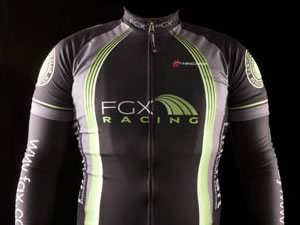
Team: FGX Racing
Designer: David Trumpf
Comments from the King of Style™
Not easy to operate on just a Blackberry when on the road for extended periods of time. I did actually write 99% of this entry on my phone, but as we’re checking out of the hotel I just grabbed some free Wifi and therefore scored time in gmail and added some hyperlinks. Without futher ado…
One of the finer things in life is roasting marshmallows over an open fire. There is something inherently American about fraternizing with friends on a warm summer’s night, sharpened stick in hand, caramelizing your deliciously bubbly, marshmallow rotisserie-style over a crackling fire. You have not a care in the world besides keeping your marshmallow from being engulfed in flames (unless you prefer that method – personally, I do).


I have especially fond memories of this activity in the midst of a relatively long European racing campaign last year, a full ocean away from my patriotic heartstrings. Three good friends got together and with some American ingenuity, we crafted a barbecue, grilled an exquisite dinner, and capped it off with roasted marshmallows. The stark noteworthy exception from the American norm being that European marshmallows are effectively the soft enlarged brethren of the marshmallow candies found in Lucky Charms cereal. That is to say, European ‘shmallows are "fun" cookie cutter shapes coming in unnaturally bright colors, with nary a white cylindrical blob in sight anywhere on the continent. Moreover, when skewed and held above an open flame, they emit strange colors that – while still magically delicious – are anything but reassuring to think what havoc those chemicals wreak on one’s kidneys.
KoS, where on earth are you going with this?!
While not saying anything about the willowy lithe model for this kit, I will simply say my mind works in mysterious ways. You see, the instinctive first thought that popped into my mind when I saw this kit was what a hypothetical European Stay Puft Marshmallow Man would look like were he to resemble the colorfully European marshmallows rather than the standard American white. Moreover, I’m curious about the bright and strange colors that perhaps would have been emitted from him were he to be zapped (or given a scrumptious black char, much like this black kit) by the protagonist Ghostbusters and their proton packs, just as the actual European marshmallows yielded bright colors when set to flame.
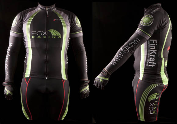
As I’ve stated recently, black is exceedingly popular in 2010, so I applaud this move as the base color despite the cries from the peanut gallery, “Black?! You’re going to disintigrate in the hot summer sun!” What’s amazing is that the cool factor from looking exceedingly good counteracts any solar rays bearing down upon the wearer.
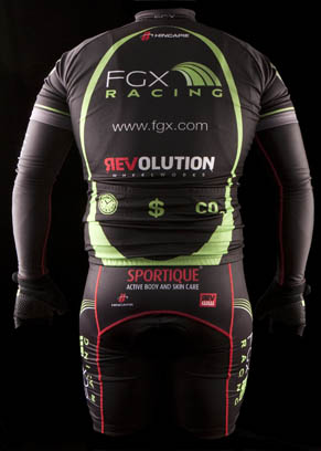
The Ecto-Cooler bright highlights, however, throw me for a loop. The jersey features a smattering of thin green stripes whereas the shorts’ lineage (that is, lines not related to the familial sort) is red. In truth I like this kit quite a bit, but believe that incorporating a few red stripes into the jersey would raise the final product score tremendously.

In any event, here is the final score.

Effort in design: B-

Ability to Elicit Audience Participation: B- *

Execution of final product: B-

* I stand by this grade, although I am curious to know what the “$” on the center rear pocket is all about.
Schmalz Comments
I’m not sure whether it was through decree or by chance, but there seems to be a great number of New York City kit designs that utilize black as a main color in their palettes. Perhaps it’s an homage to the black kits of Cervelo from last year or to the inky ensembles sported by Team Sky this year, but one thing is certain—black is back—but of course, this is New York, where even disposable diapers come in black, so it’s not like black has ever left.
The FGX Racing kit is definitely on board with the black revival. FGX is a green shipping company, so it seems a bit somber to have such a dark kit, and I’m sure the internal debate (and God help the designer of the kit if they had an internal team debate) had at least one dissenter that worried about wearing a black kit and the potential 2 degree temperature increase from the dark color absorbing the shining sun. I hope that the designer reminded their recalcitrant teammate that most NYC races are at dawn, and that black is slimming, especially when you’re sweating like a game show contestant in 90 degree heat.
The look of the kit is a conservative one, which is fine, although it’s a bit staid for my tastes. They don’t seem to get a lot of logo "bang for the buck", but that’s due to the elongated nature of the FGX logo itself—when it comes to logos, like colorectal scopes—compact is where it’s at. And I can say that if I were involved with the design of this team’s kit, I wouldn’t be able to resist using that green rainbow as my inspiration, resulting in something that would look like the following.
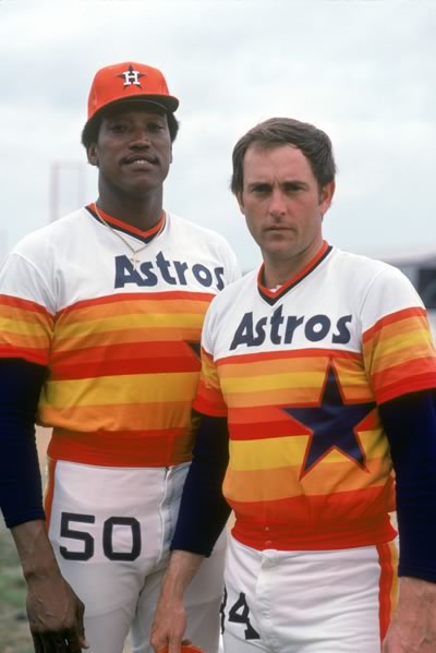
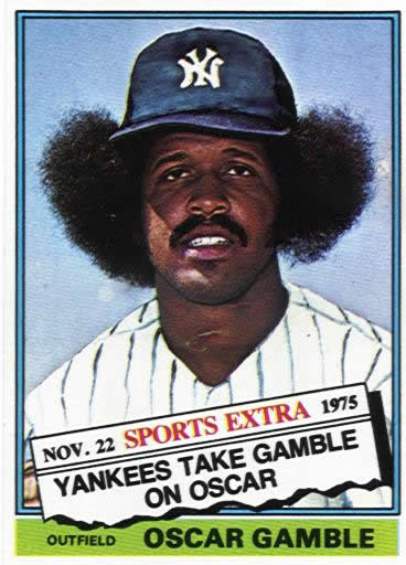
And of course, I would also mandate that all team members grow the following hairstyle, to complete the look properly.
Who we are.
Dan Schmalz, when he’s not typing aimlessly on the internet for free, is a graphic designer who has owned his own firm for over a decade. His work has been published in numerous national design publications, and his work has received several national awards.
Ted King is still a pro-ass bike racer who rides for the Cervelo Test Team, he also comments upon sartorial cycling issues under the moniker "The King of Style."
If you want to have you team’s kit put through the fashion critique wringer, drop us a line, and we will try to be gentle.

Is that “package” stuffed or does it really fall within shipping guidelines?
Is that a girl or a guy?
bedouins wear black
stop flaming CJ, he’s one of the nicest guy you’ll ever meet. Who are you to judge?
stop flaming CJ, he’s one of the nicest guy you’ll ever meet. Who are you to judge?
but those are LOOSE FITTING, makes all the difference, and these clearly are not
The Font type on the front jersey…waaay too small. It should be bigger and more bold. Its the only text on the front – go big. Why is the rib cage text bolder than the chest? wierd and not a good. I would’ve liked to have seen the the graphic symbol of the (green swirl) exploited a bit more – lots of potential there. The colors are good. The black is good as long as there’s something opposite thats interesting and bold. This is why cervelo test team works. The graphic symbol gives the kit dynamic. FGX could take some cues. The symbology on the pockets (nice touch)but bigger. Love the red stitching and the grey color swaths sprinkled in. Again, the colors are great, the layout for the most part is really nice too – but the font type and size on the front chest needs attention.
Ok..BH Garneau.
The twin concept….original. cant say I’ve seen it done anywhere. I like the nod to the M Lynch kit but honestly it looks like someone put that kit and the old DKNY squad together whereas no one kit wins out. Asymetry is tricky but nice if done well. This kit does all the right things in terms of font / lettering. Nice racy graphics across the board – well done. The color concepts, also very nice. All in all this kit succeeds except for one thing. The rear of the bib short – what happened here. The black side must’ve won the coin toss. Perhaps this is a manuf. drawback to the design concept but I would have liked to have seen the colors wrap around the thigh or atleast allude to that idea. It sorta looks like a mistake. Love the gloves but not a fan of the lettering on the fingers (beer powr)? I guess I dont get it and it sorta looks like an after thought.
RL
Mmmmm mmmm, those are mother hips and I want some meatloaf! Now! Mommmmmm!
you could unsee something?
Looks like a fat can of Axe body spray.
It’s not the worst jersey, but definitely not something that stands out. It kinda reminds me of those pre-made jerseys wherein they just print your logo and voila… your own “custom” jersey. Plus it seems like everybody’s wearing black nowadays. Where’s the creativity, Chauncey??? Oh, and that red stitching on the bibs sticks out like a sore thumb. The slime accent color is just ok. In the front, you have the slime stripe on top and it morphs into one thick slime on the bottom part. You got the same thing happening on the bibs. How come you don’t have that same theme continuing on the back? Hmmmm… the more I look at it, the more I think the design is also kind of dated… early 2000 perhaps. My design instructor will probably give it a C for effort and turning it on time. With that said, I like having these jersey critiques on your site. I design jerseys on the side, but I don’t really have a whole lot of folks I can get proper feedback from.
LOL JAMMET = STAY PUFT, DON’T CROSS THE STREAMS
surely FGX has some skinnier models they could have used.
Go, Christophe, go! Just like Zoolander!
When is the baby due?
I like a kit that shows off the proper paunch of a middle-age amateur bicycle racer. Two thumbs up.
WTF can you make him even fatter ?
you stash your money.. Hello?! Please don’t ask about the CO2 pocket as well..
wrong. now you look stupid
I think last years FGX kit was better looking. That said, you guys should have gone with the new Hincapie velocity line or whatever it is called, way nicer.
It means FGX saves time, money, and produces less CO2 gasses.
Isn’t it about time you brought this time saving, cost cutting, and green shipping model to the appropriate person or persons in your company or firm? You can take all the credit!
I like the overall look. Not very pro, more club like. I would give it a B if they had reverse colors for the summer. That kit look like it will roast the racer on sunny days. And what’s with the fat model? Really? Ok, it’s nice to see the team has a sense of humor.
When did FGX sign Jan Ullrich?
good friends don’t let tubby friends model cycling gear without a girdle.
ted king is the best thing to come along on nyv in a long time, really funny. this review idea was brilliant. nice going schmalz.
looks nice. better than the white when being festooned with mud during CX
pretty generic but really who cares? no one sees us at 630am except homeless people and insomniacs.
CH4 would have been a nice touch over the butthole
looooooooooooooooooool
pork pies and meatloaf= fgx model
CH4 on the b-hole. Brilliant!
That model’s a blow-up doll, isn’t it?
We’re taking pre orders on the CJ inflatable sexing doll now. Act now, quantities are limited.
mean FGX saves time, money, C02
get it?
say what you want, it’s a better looking kit than bh/garneau
with those rolls?
a fat back!
I really like this kit. True, it’s no dissertation in design, but it’s a nice, clean, recognizable design that stands out in a crowd of uninspired, template-driven kits. It also plays nice with last year’s kit.
I could not wear black, though. The heat-stroke potential is off the charts.
i read they did a study and having a black kit doesn’t make any difference on hot days vs a white one. but psychologically it would seem like it would be hotter. anyway we do most of our racing before the sun is fully out so then it truly doesn’t matter..
Ralpha wears black and they never break a sweat.
Eating too much fat back = http://tinyurl.com/qho5p2
Its comments like those posted that keep me coming back!
I had a good laugh without even reading the article, agh my stomach hurts now…
Seriously what up with the model? Was it really that cold in NY that everyone built up a layer that thick this winter?
besides the front panel, it looks pretty nice. however, the front panel hurts my eyes.
i think that that little graphic next to the FGX lettering should be larger and cover the top half of the front panel of the jersey. The “FGX racing” wording can be enlarged and be placed under the green-rainbow graphic.
also, more red on the jersey would be nice.
Are those seams made from unobtanium? They strong, yo!
This is shit and the model is fat.
Best kits I’ve ever seen: Lombardi Sports pres. Adobe Schwalbie 2007, Lombardi/HDR 2009, BPG/Montano Velo in 2007.
Sheer beauty:
http://norcalelitecycling.com/
Those jerseys are crap and that logo belongs on a truck stop.
For Lombardi that is
http://www.atomicecho.com/cycling/img/footon_servetto-fuji_2010.jpg
Damn. Those Footon-Servetto-Fuji kits reminded me that that is what I’m going to look like riding tomorrow if I don’t get some laundry in the washer.
that is how we ALL look to the outside world, regardless of kit design
no. maybe “regular” people think we all look dumb, but the servetto kit is up there among the worst professional sports uniforms i’ve ever seen.
cj, rock on man – phat kit
Isn’t black a “slimming” colorway?
faaaaaabulous kit. i could see a prada saddle bag and some jimmy choo shoes with that ensemble
“caramelizing you’re deliciously bubbly, marshmallow”
I believe you mean “your,” good sir.
I wrote that entire review on my Blackberry. I apologize if I was cross-eyed and have carpel tunnel by the time I finished it. Also it left no room for an editing session, good sir.
oscar gamble rode a mean afro.
cat i went to high school with had a fro so big, he kept joints stashed in there
Hi,
if any one has room in their car going to Battenkill tomorrow (friday) around 6pm, i would love to catch a ride. I am not racing i am actually just connecting with a friend and heading farther upstate, so i can be dropped off anywhere and i will not have a bike with me. I dont take up much space and would be happy to sit in a middle seat 🙂 oh and i have gas$$
Email me ASAP!
thanks
-BrittLee
BrittLeeB at gmail dot com
Dear Ted,
I sincerely apologize for calling you out on the typo. Please know it was done out of respect and an obviously failed attempt at humor. We’ve all had our fair share of typos (even the great Michael Scott leaves the “h” out of Dwight’s name in the Threat Level: Midnight/Michael Scarn episode…).
Seriously, I’m a huge fan of your work, blog/Twitter/etc.-wise and on the bike. Keep it all comin’. Holla.
Now I feel like a loser,
Someone who is not a sir
Unacceptable!
That’s not a heart rate strap. That’s a layer of bacon fat under CJ’s man boobs.
It’s a “Bro!”
Mansierre!
The Finkraft racing kit that is given in the article is so wonderful and trendy. It is of the sort that the racers @@Telesteps Ladder @@ of the present days want their suit to be. David has done a very good job by creating the trend in the field.