Team CRCA BH-Garneau
Designer: Dan Schmalz


Designer comments:
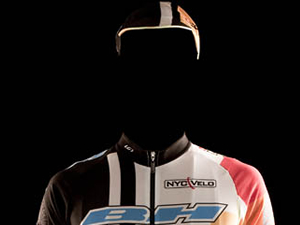
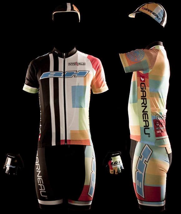
Well, since I am the designer in this case, I will go ahead and say that I like the kit—as I designed it—and I try to not design things I despise. Kit design really hinges on the quality of the sponsor’s logos. BH and Garneau have very well done logos, and that’s half the battle. Sometimes you just have to place the logos and get out of the way. My idea for this kit was to pay homage to the past Merrill Lynch kit while moving the kit design forward—plus this kit will match almost anything. I also really like our hats.
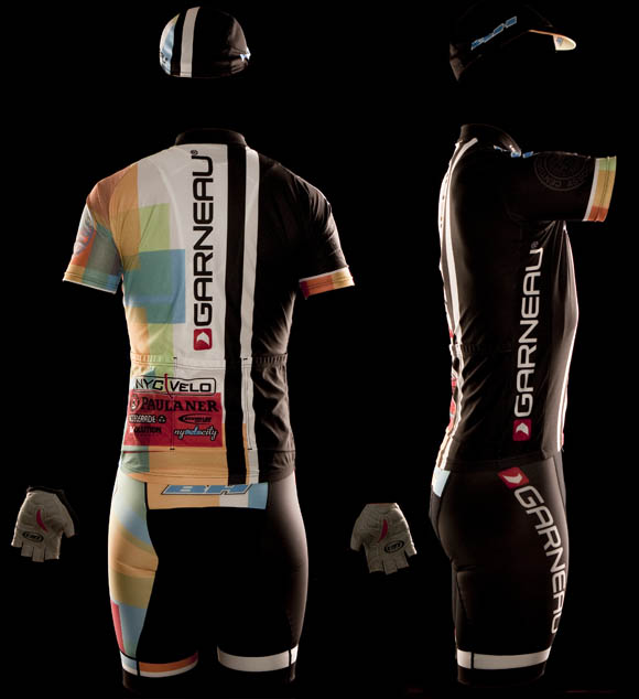
I went with an asymmetrical look because it’s one of those rare opportunities in life (being on a bike) where you can dress that way without being in a Flock of Seagull tribute band. It’s an opportunity that’s not to be missed. I think we gave the sponsors a great showing with the logo placement and prominence. Next time I think I will change the Garneau logo on the shorts from a vertical orientation to a more old school horizontal band around the bottom of the shorts. I would also add a black panel to the colorful side of the jersey, but to me these are minor tweaks—if you’re afraid to be fabulous, you have no business being on our team.
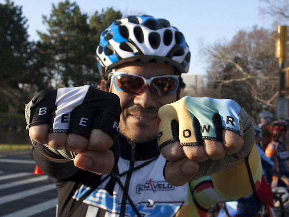
I also think that the knuckles will be the new future hot spot for sponsor placement.

From the King of Style™
If nothing else, it’s bold. Brazenly bold. My knee jerk reaction to the floridly designed BH-Garneau kit was a mild state of shocked dismay. While the stark black, left side of the kit is straightforward and conformist, the boisterous right reminds me of a pastel obsessed tartan somehow crossed with an Easter themed, stained glass window. After collecting myself, in order to allow some perspective on the matter I asked the opinion of a reputable cycling friend of mine who happened to be sitting close by. His eyes opened to saucer-like proportions, whereupon he casually offered, "I can understand the black, but to me the right side is just white noise." I had to disagree. White noise is calm and soothing. That, friends, is a cacophony.
But wait… what is that? Could it be…? My oh my, this is nearly unheard of – upon closer inspection, the mere existence of a single sponsor’s logo landing squarely (err, askew to the left side, rather) on the rear of the jersey has extracted the BH-Garneau kit from its previously foreseeable destiny of the infernally ostentatious abyss of gaudy kits. Paulaner, redeeming and delicious.
p.s. "BEER POWR" just screams radical. A formidable appurtenance, for sure.
Execution of final product: C+
Effort in design: B+
Participation: A-
Who we are.
Dan Schmalz, when he’s not typing aimlessly on the internet for free, is a graphic designer who has owned his own firm for over a decade. His work has been published in numerous national design publications, and his work has received several national awards.
Ted King is a pro-ass bike racer who rides for the Cervelo Test Team, he also comments upon sartorial cycling issues under the moniker "The King of Style."
If you want to have you team’s kit put through the fashion critique wringer, drop us a line, and we will try to be gentle.

Bold- I like.
the kit is almost like two-face from batman. take a guess which is the evil side?
As a graphic designer myself, I like the fact that a different style approach was used to design this kit. It’s unique. Not ugly, not great… mostly unique. As a racer, it’s not very sporty or intimidating, which is fine by me, since I am neither fast nor slow and sport a little bit of gut. I’ll wear it. Where do I order?
Just a team kit, we didn’t order any extras to sell.
Back in the day using colors in custom uniforms were expensive. Black and white were the only “free” colors. Now that colors have no additonal cost half the local teams use mostly black and white. My team uses only black and white.
So I think the combination of the two is very origianl and creative. It adds a strange effect like a strong shadow when seeing a rider in the distance. Grade A+
The kit stands out. I can spot the BH-Garneau team esily in the pack. I can’t say that about my team mates. Grade A
Sponers name is easy to see in print. Grade A
Overall look. The Merril Lynch design is lost on me, and would have like to see this idea with something different. Grade B+
So a very functional, some might say contrversial design. But that’s just my opionin.
So if the right side of your body is hotter than the left side, won’t that make you ride around in circles?
tom
Our handlebars are mounted pointed ever so slightly to the left to keep us straight.
What’s a ‘sponer’?
great kit, and unique. nice job dan
I can’t make fun of the old kits – these are sweet – congrats – glad “What Not To Wear” got hold of you guys.
any web link to Schmalz work?
Sadly, no. Too busy to make a web site.
“BEER POWR” just screams laziness to me
Dan, you might as well admit it – that you wish you thought of applying an argyle pattern to cycling kit first.
it seems like a bad idea now, but would you really have seen argyle coming?
I’m sensing buffalo plaid myself.
what’s with the saggy butt?
lol
Well it really seems like a mix mash of previous jerseys. The black and vertical black stripe remind me of Cervelo and older BMC jerseys’ (pro teams). The faded blocks of colors looks like an old Mapei jersey that was left out in the sun for a few months, what up with that? Why not some full colors, like others have stated its not like you pay extra for full colors or non-faded colors. Then again if its pre-faded you can wear it longer (years) and no one will know its old, but then again it looks old already.
I will give it the + bold points and a nice duality point for the different sides but it fails on the weak colors.
it’s like a bi-polar, or schizophrenic kit.
Hey Dan,
Was that a prototype in development for team issue neckwear? very nice i may say so.
no team ascot?
The scarf was a necessity for the cold, it was very toasty at the beginning. Later on, not so much. It’s surprisingly hard to get a scarf into your back pocket while riding.
the term is “whilst riding.”
silly american….
or the horror of Footon. Or the bleh of Astana.
or brown paisley arm warmers would really tie this ensemble together.
It looks like a rider with the old DKNY design ran into a NYSketches rider
that kit is hideous. Are you colorblind. Why are you parading this around like it’s good. How did the WHOLE team approve of this? Wearing spandex alone takes courage but wearing that…?
You have to wear that all season. I really feel for you guys, I hope your self esteem doesn’t hurt your training.
that but can TT with best cat 4s
I think it’s a really good looking kit
fuck the haters
I got it Chavy Chase.
Reminds me of Jekyll Hyde meets Joseph and the Amazing
Technicolor Dreamcoat. Just wondering, who’s modeling the kit in the pic?
strong to quite strong. i like it.
whos modeling..i told you chavy chase
http://www.imdb.com/video/screenplay/vi2292973849/
really diggin the racing stripe. nice job bud!
Compared to the newest pro-team kits like “Lance’s Shack” and “Black N’ Blue Sky”, this is far, far, far better.
I think we’re used to the usual mishmash of main logo plus randomly placed smaller logos in a mostly symmetrical, mostly bland, overall design. It’s been that way for as long as I can remember, and the curmudgeon in me might have preferred things to stay that way. I also really like(d) steel bikes, but alas…
I actually think it’s pretty cool that Dan, a nice guy who I’ve actually met(!!!!), is designing new-style kits better than the pro teams, even if I’m not completely sold on the overall idea yet.
(Man, on re-reading this it kinda sounds like I want to hump Dan, but I promise that wasn’t the point, and that I DON’T actually want to hump Dan, regardless of how soft his “designer” hands might be.)
It’s OK Mr. Flange, I get hump requests all the time.
http://www.youtube.com/watch?v=tv5z4yWbLro
the Kit has too many designs going on you don’t know which is the core design. kind of like the Car from the 1970’s Manufacturer’s Hanover Bank Commercial.
Are these the Easter kits?
It’s nice to have an anonymous way to post. That way when I criticize this uniform no one will laugh at my fashion sense, or lack of.
I don’t like the uniform at all. It looks like LG had two teams that didn’t buy their uniforms and gave you a deal on them by sewing the two halfs together. Each half of the uniform looks good, but when you put them together they look like a clown outfit. Oh well, there is always next year to get it right. 🙂
I like it. How can I go about ordering one?