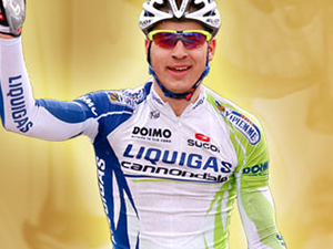
This week, Mmmaiko the QQQueen of Style (QQQoS™), looks at the Liquigas kit. Photos courtesy Liquigas Cannondale.
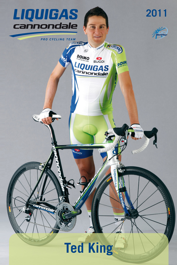
What are endurance athletes but caffeine-enabled bundles of scar tissue, bruised tendons, and aching muscles trying to hold back a caffeine-enabled case of the trots? Only cruel serendipity would compel a company named Liquigas–or as Phil Liggett calls them “Leakygas”–to take the mantle of sponsorship in cycling. Thankfully, someone (perhaps an Anglophone) at Liquigas decided the company color would be diametrically and anatomically opposite to “leaky gas”: the “vomity bile” green. Actual bile is deep green, says medical literature, but based on empirical evidence from post-bender hurling, I say it’s a lighter, yellowish green.
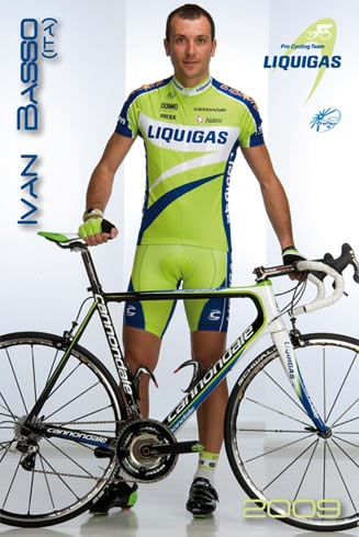
This green by any other name would still assault your eyeballs with its day-glo fluorescence, and it’s been one of the most divisive issues in cycling this side of doping and race radios: most people can’t get beyond it, some embrace it. I actually saw the 2010 Liquigas kit in person at Tour of California while stationed next to their RV to direct foot traffic. Being surrounded by Liquigas riders (who were super friendly and nice to fans) felt like starring in a modern retelling of Cinderella, in which she goes to a rave with a gregarious retinue of anthropomorphic glo-sticks. Thankfully, I didn’t lose my shoe like Cinderella, which meant Prince Pippo didn’t come to my house looking for a second date, nude and oiled, with a strategically placed shoe.
Post-2005 season, Liquigas bloated their kit by adding chevron stripes that looked like the bent cousin of Kelme’s blue/green ombre vertical bands. With the 2009/2010 designs, they went back to the pre-chevron concept, distilling it down to acid green with a white panel behind the sponsor name, accented with blue and white swooshes across the front. The design wasn’t a stunner by any means, but it was photogenic in the way pageant queens glow bare-faced without the aging pancake makeup. As derisive as you can be about the Liquigas green, you have to admit it pops against any landscape, from the snowbanks of Passo Gavia to sunflower fields of France. Riders in acid green forming a perfect TTT paceline or clustered around their pink-clad race leader is a beauty shot of cycling, the kind that sells calendars for cycling photographers, one of whom, ahem, should be saving up for a moob reduction surgery.
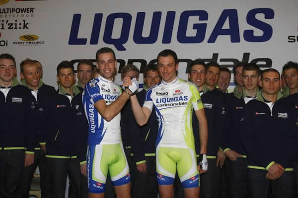
 This is why I found it a shame that for the 2011 season, Liquigas revamped their kit significantly, once again adding extraneous elements. From front and back, the new kit is predominantly white. My additive color theory states: white plus fluorescence of acid green plus Europoid pale skin equals totally washed out. This has improved as long sleeves are rotated out for short and sunnier racing conditions deepen tans. The jersey has blue or green on the sides splintering into arcs and blades, I suppose, meant to symbolize optimal fluid dynamics. Compared to smooth borders between colors, though, these fragments break up the space so much it seems they’d create drag like Daniel Oss’ giant hesher ‘fro. The swooshy design exudes an almost dancerly air–not linear speed–as if Leopard-Trek should have invited Liquigas 2011 to do a dance routine at their team spectacle. For me, personally, Peter Sagan’s “Ta-daaa! Nothing up my sleeve!” victory salute at Giro d’Sardegna totally upped the fancy dancy quotient. So it was a disappointment at Paris-Nice, when his tire supposedly rolled off, that he didn’t somersault off the bike and stick it like a serene, graceful eye in a storm of twisted metal and scraped skin.
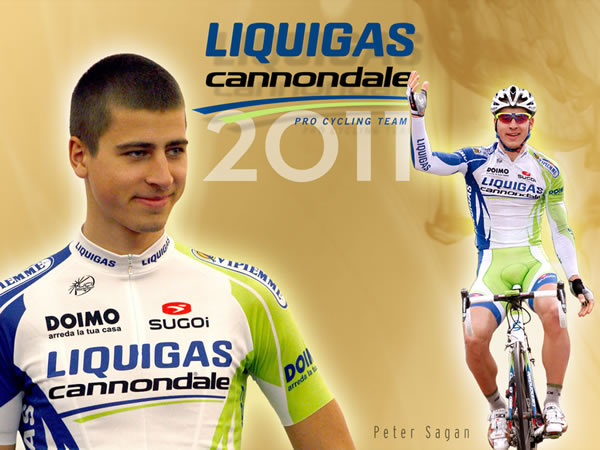
Many teams went with asymmetry as their 2011 design theme and Liquigas is no exception, with blue lining the right side and the signature green the left. This makes the Liquigas rider in side view look like Two-Face of the peloton: the right half Quick Step and the left, Liquigas. While most riders after a bad day would say they didn’t have the legs, expect Two-Face not to have the left leg for the Northern Classics or the right leg for non-sprint Giro stages. Note to Patrick Lefevere: you should consider a Two-Face kit design as an excuse for a bunk Classics campaign since you lost your whipping boy Stijn Devolder and sending Boonen to the bad boy’s paycut corner didn’t work, but please pay me royalties if you use my idea. I’m also hoping this Two-Face look leads to social awkwardness in the peloton with a rider sidling up to the blue side of Liquigas thinking it’s his Quick Step friend or foe, setting off a comedy of errors with a careless whisper.
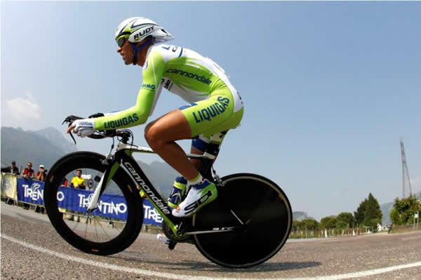
It’s always awkward to get into a team’s brand new kit design. It’s like sinking into the “on” phase of an on-and-off relationship. I’ve run hot and cold on Liquigas kits over the years, but now I look back on their ersatz Kelme era with a sneering fondness. The ombre stripes were kind of busy but still gave the kit a unified look. While birthday cakes should come piled on with decoration–buttercream roses, rainbow sprinkles, Garfield photo print–cycling kits fizzle when they’re too embellished and unfocused. With a banner year behind them, Liquigas is emboldened to take the Giro and Tour one-two for 2011. I have to wish them the best because the sight of pink or yellow clashing against the acid green would be less of a style offense than this busy, Two-Face mess they created from a design that wasn’t broken.

Amen. Great analysis.
Lik-Qwee-Gass, eye-tal-yawn pronunciation…
Green as in eco friendly clean burning (oxymoron)…
always thought some bubbles, methane release, would be “ap-pro-pro”
your best crit-sertation yet! F.I.T. is waiting for you…
A lot of that ‘leek-we-ghass’ was natural gas from Khaddafi’s wells. Probably not so much these days. Berlu-talia signed a big contract with him back when he had his brief moment of clarity about 6 years ago.
How about some analysis of Ted King’s self-consciously non-committal faux-hawk?
It’s like Europe and New Hampshire are battling on his head.
weird things happen to guys in leekweegas kits.
http://www.goathork.com/~brose/soapbox/uploaded_images/gaycyc1-715842.jpg
i agree about the battle. think he styled it with maple syrup?
New New Hampshire motto:
“Use Flowbee or Die!!”
Hey, the lady in top photo – doesn’t she host a show on MSNBC?
never photographed together. Coincidence? I think not…
When my fluid dynamics are optimal, green and blue ain’t the colors I’m seeing.
And wtf kind of name in any language is Liquigas? It means the same in every language except Basque and usually follows the excesses of Christmastime eating in Europe. Just type “Putain!! J’suis plein de liquigas” and see for yourself.
Wow Sal Scotto made it to the big leagues