The Queen looks back
This week, Mmmaiko the QQQueen of Style (QQQoS™), returns to look back at a kit from the past season. This week she reviews the kit that was Cervélo Test Team. Photos courtesy Jason Gould.

Writing a eulogy sucks. If I have something nice to say about you, I probably didn’t want you to die. Besides, it’s much easier to throw dull, rusty verbal knives than to grace with heartfelt praise. But in recent memory, no other professional cycling kit has won near-unanimous approval like Cervélo Test Team’s ensemble, so I’ll do my best to give the kit a positive send-off to rainbow bridge.
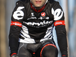
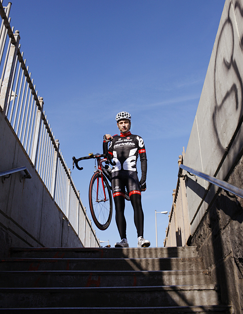
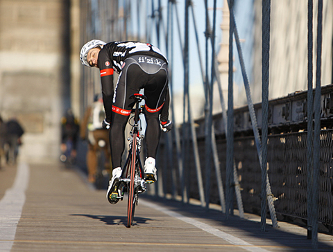
Mostly black and white with a touch of red, the Cervélo Test Team uniform was the cycling equivalent of a tuxedo with a scarlet flower boutonniére. It’s not the ill-fitting rented tux of junior prom, but a tuxedo worn by some fictional, pheromone-oozing spy–dashing, sexy with a hint of menacing. A pack of Cervélo riders in the peloton looked like a murder of glossy feathered ravens amongst colorful songbirds. Imagine Heinrich Haussler’s frosted hair and baby face with, say, a Lampre or Liquigas kit; he’d be a hot mess, writhing in defeat or quietly sobbing in victory. Cervélo’s dialed-in look helped give Haussler the appearance of the serious contender that he is–easily forgotten with his penchant for bedazzled Ed Hardy.

Cervélo was blessed with a design-conscious title sponsor with a reasonable name. Fitting “Androni Giocattoli-Serramenti PVC Diquigiovanni” or plastering “Scott-American Beef” on the slickest of jerseys would pummel it into design impotence. Cervélo further distilled their brand down to the é (e-acute) logo in variations. Specifically, I want HTC-Highroad to notice the elegant symbolism of the mirror-image double é logo that suggests wings, and how beautifully it contours the torso without cheapening the look. It’s also worth noting that Cervélo doesn’t limit its subtle, stylish branding to their kits: have you noticed team staff in Cervélo logo high tops, or Emma Pooley on the Worlds TT podium with é logo earrings?
Really, though, the measure of a well-designed cycling kit probably rests on the muffintops of the recreational cyclist. Living in an area with an Ardennes-like terrain, I see guys laboring over one rolling hill after another in a one-man gruppetto. There’s the guy in a threadbare circa 2005 Discovery kit, one in a Livestrong jersey with acid wash jeans (thankfully or not, actual jeans, not acid wash-print spandex). Oh, there’s even a guy with a perm in an old Liquigas jersey–I kid you not, a wannabe Pellizotti! But the two or three guys rocking the full Cervélo kit? Miraculously, their non-racing, desk job physiques are camouflaged as if wearing a merciless set of Spanx. They look like they’re suffering the least up the 15% grade. No, they’re not God of Thunder, but God of Thunder wouldn’t be embarrassed having these mortals run his errands.
And so we bid adieu to the Cervélo Test Team and its dark magic of a kit. When the team’s demise was announced, the star riders must have been courted passionately, but the smart teams would have wooed the design and branding geniuses. UCI points are nice, but style points are all the more elusive in professional cycling these days.

Racing for a pro team next year or back at Bicycling and racing da gimbels?
from freshie to retro in one season
Black is tired. Black is passe. Black is black, and that means I DON’T want my baby back. At least if she’s wearing black.
Good riddance.
“So long, farewell
Auf Weidersehen, goodbye
I leave and heave
A sigh and say goodbye
Goodbye”……..(lyrics: Sound of Music)
Goodbye “Béyond Thé Péloton”……
Cervelo Test Team! It will go down in cycling history….
I *hate* the e. I would purchase a garmin cervelo top if not for the massive es. Just use the whole cervelo!