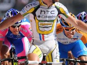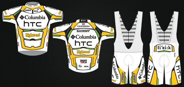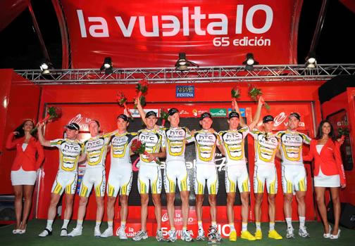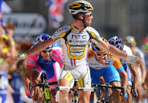
Bob Stapleton’s childhood must have lacked hugs and lollies—or at least that’s how I imagine it. The guy’s wealthy enough to finance a professional cycling team with his own money for a season, but instead of being nonchalant about it, he did a team owner’s equivalent of the attention-seeking kid at the playground shrieking ad nauseam “Mom! LOOK AT ME!” The team bus boasted their No. 1 status and riders were kitted up in thinly disguised superhero costumes—out went the simple, retro charm of the old Highroad kit, and it was hellooo, fake abs!

The design firm that created the HTC-Columbia kit says the inspiration came from “GP moto” and “high performance protective gear.” (That could mean anything from Kevlar body armor to condoms, no?) But it’s pretty obvious the free association went something like “cycling, superhuman feats, superhero!!!” While superheroes test the tensile strength of spandex with musculature all their own—though someone should tell Bruce Banner about spandex-blend fabric so he wouldn’t rip all his clothes?—I’ve studied shirtless beach volleyball photos from Garmin-Cervelo’s training camp recently and must report this is not the case with professional cyclists. Their typically slim build doesn’t “ripple” or “bulge.” Apparently, HTC-Columbia believes our eyes must be fooled with symbolic muscles so our brains can understand their riders are athletic übermenschen with bulging palmares.

I credit the team for toning down the obviousness of the abs over a few redesigns, but it’s still only a step or two from wearing a T-shirt printed with a muscle-bound torso to be “I don’t actually work out! But I’m hilarious, riiight?” in an attempt to highlight one’s mastery of defensive humor instead of moobs and muffintops. I think the faux abs are less embarrassing on brawny riders like Andre Greipel than, say, Tony Martin whose extreme zombie face makes the design look like a ghastly, hollowed-out ribcage than a panty creamer six-pack. And let’s be clear that no amount of drawn-on muscles can make Bert Grabsch not look like the guy “sweating like a pork.” (I say this with affection for pork and Bert.) Keep in mind this juvenile superhero fantasy kit was forced on the women’s team as well.
I’m wondering if the Highroad management had some cultural awareness to understand that six pack abs jumped the shark in late 2009 when MTV introduced us to “Jersey Shore.” Sculpted abdominals now stand firmly in the domain of horny, hair gel-encrusted Guidos, who would, if given the chance, also totally ride around in a bus that boasts they score a lot. It looks like Highroad’s media training didn’t keep riders from happily leaking images of the 2011 abdomnials-free kit. I think the 2011 HTC-Highroad roster may owe a thank you note to The Situation for putting R.I.P. in “faux ripped abs.”

not the kit, the fix on the write up.
…that they could not have picked a more awkward “yup, that’s my penis” crotch panel design/color.
http://www.thesituationshirt.com/
As a graphic designer (25+ years in L.A.)I can say with total confidence that NONE of the so called designers of cycling jerseys have a clue as to what they are doing.
Never seen uglier and more amateurish design as I do when the peloton rolls by.
There is not one team who seems to be wearing anything that was designed with any knowledge of balance and color and HTC’s kit is only marginally better than Footon-Servetto’s skin suits.
Laughable stuff.
Only thing worse than the kit is a designer knowitall
25 Years in LA. So, that’s, like, better than 25 years in Wilmington, Delaware?
I have to add that if I had to pick the best of the bunch, the prize would go to Garmin for, at least, trying.
Some thought actually went into their kit.
They get a 7, out of 10, which is many shades better than the rest of the lot.
L.A. can kiss my V.P. ass. Wilmington RAWKS!!
Oh wait, did he mean the ‘other’ LA?
IMO a lot of the amateur kits I’ve seen from teams around the country look better than many pro kits. No idea why these teams can’t get it together on kit design. The worst I’ve ever seen is that monstrosity with all the billiard balls that Tim Johnson wore while racing cyclocross a few years ago… hideous.
Wait, Maxmillian has been in LA for 25 years? Were you miniaturized like Dennis Quaid in Innerspace? Did you see any EPO taken during this time? What did Sheryl Crow’s tonsils look like?
agree. the pro peleton could use some sartorial coaching from the amateur peleton. practically every local team kit is far better designed than most pro kits. also,why didn’t columbia use the design expertise of their sponsor?
So, what have you designed? Why not offer your estimable talents?
you wheelsuckers hate all kits, and then talk about ‘how pro’ each other looks. morons. it’s a fine kit.
That’s the nature of the design business, if you put a design out in the public realm, anyone with eyes gets to say whatever they want about it—as that’s your audience.
all your designs are belong to us.
…What cracks me up about all “sciences” is that the technical nature of the issue doesn’t always jive with what real people actually like to see. It wasn’t designed so that designers would critique it. It was designed to make people want to buy the shit on it. This kit may not adhere to the technical data that they teach in school, but it does look cool when Cav sits up with his arms in the air as he crosses the finish line. Isn’t that ultimately what matters?
also designed so that we all know that Cav’s package hangs to the left.
cav’s jersey should have “how’s the view?” printed on his back.
@ Geo. Grapher
A conscientious designer can effectively solve multiple problems, including aesthetic and marketing challenges (not to mention designing around the limited and varied “real estate” that the human body provides) so… it’s all possible, despite seeing so many failures over the years.
This is one of the many things that makes good design so rewarding, to those who respect it.
There is no doubt that HTC dropped the ball here but the main thing I, and apparently Schmalz, find so amusing is their clumsy attempt to emulate a super hero.
(even Kick Ass did a better job at designing his garb than HTC did)
btw
Cavendish never looks cool, no matter what he’s wearing… or shilling… as he crosses the finish line.
Wait until you guys see RAPHA SPRING TWEED – it will SCHWETTYERBALLZ!
me thinks you protest too much re super heros! put the action figures down…and maybe offer up what you think is good design…you sound like a cycling jersey T bagger for super heros…
the logos get their own space, it looks like a mx chest protector… and they win…
jersey need to be seen, by team mates, commentators, helicopter cameras…HTC does that…
now Black and Blue (SKY, Cervelo-Garmin, how are they gonna tell whos who???)
Lampre is good
Rabobank
Omega-Lotto
Saxo Bank-Sungard…
Andro Italy is bad
RadioSuck
BH anything
French anything
Flame On X Men!!!
isn’t that evelyn stevens in htc usa champ kit?
terrific to see local gal done good. such a positive story. go get ’em in ’11!
http://www.cyclingnews.com/news/photos/htc-highroad-unveils-2011-jersey-design/152063
OWWWW MY LOS ANGELES-HONED DESIGN EYES ARE REVOLTED!!!! THEY’RE BLEEEDING!!!!
the htc kit is bloody painful
Congratulations, that HAS to be inthe running for douchiest comment of the year.
it reminds me of a cross between one of those cheapo kiddie skeleton costumes and power rangers
I try to like velocitynation. I really do. But, it’s hard to like a web site when it receives the quality control attention of a 12 year old’s myspace page.
This story is a good example. It begins, “enough to finance a professional cycling team with his own money for a season, but instead of being nonchalant about it…”
Uh, where’s the beginning of the article? And, this is just one example. For instance, when looking back at older comics, why is every issue shown twice?
Guys, you’ve got some good and funny content on here. If you’re going to manage a web site, manage it.
H is for Hobby
Well, it is our hobby, but in this case I can’t replicate those mistakes Arthur sees. The article begins “Bob Stapleton’s childhood…” on multiple browsers and devices for me. Anyone seeing the same thing Arthur’s seeing?
seeing the same thing. Everything right of teh picture is cut off. Same thing happened before, I think it was on Scmalz’s log. I run windows…
Ok, should be fixed now. Schmalz and I are both on macs, so just let us know if something’s off, we’ll fix it, no need for rants, ok?
I think the idea they had was quite cool to be honest, although i’m not sure they pulled it off quite right. I run TEAM CARBONYZED – a UK based pro & charity cycling team and we are currently designing our 2010 kits – and despite my opinion that this kits ideas were good, some of you seem to disagree. I mean, we are looking at a base colour of white, with black and yellow detailing, quite simple panels but with some fine and fancy detailing around it. In essence we were going for a less bold version of the 2010 HTC kit.
You can check out our design at :
http://www.carbonyzed.com/team/2011_kit_design_process.html
and give us feedback to help us improve.
We would really appreciate it, thanks,
Henry Aspden