As a new feature here on NYVC, we will be having mmmaiko reviewing pro kits under the moniker the QQQueen of Style (QQQoS™). If you are a fan of the inimitable KoS™, do not despair, he will continue in his capacity as ruler of the amateur kit realm, as the KoS™ is nothing if not wise. And what is wiser than NOT commenting upon the clothing of your contemporaries? Especially when they can reach out and smack you during a race. All photos courtesy the Footon Servetto website.
2010 Footon Servetto Postmortem 
I can review the 2010 Footon-Servetto kit in three words: "WTFUGLY. The end." But I really should earn the backrub that was promised upon turning this in, so allow me to expand that thought. I had to know more about Dario Urzay, the man passing himself off as designer of cycling kits, so I asked Google. He’s a Basque photographer/painter specializing in colorful abstractions, but more importantly, he designed the 2004 Athletic Bilbao soccer kit, voted one of the "10 of the Worst Football Kits" by ESPN in 2005. I believe all post-2004 Euskaltel-Euskadi rider contracts limit team displays of Basque pride to just south of hiring Urzay as designer/consultant.
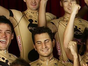
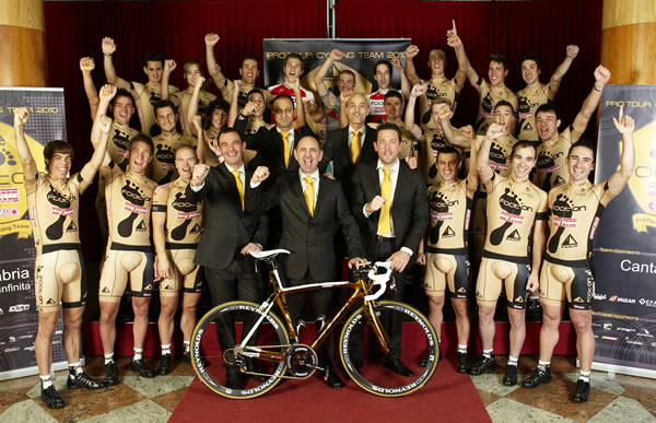
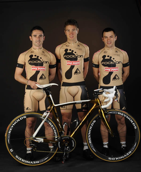
Officially, the color of the Footon-Servetto kit is designated as "gold," which makes me think there’s a subset of colorblindness that makes one confuse a fleshy-beigey color with gold and a sub-middling cycling team with a winner deserving of gold. This flesh color might complement the UV ray-shirking alabaster skin of an albino cyclist, but the effect of this color on non-albino cyclists? Instant nakedness. The team might as well be sponsored by the act of streaking.
Truthfully though, not even the slickest, non-flesh tone kit could withstand the design stank of Footon’s logo. We’d snicker at Cervelo if their kit featured feet instead of the "é", yes? Foot fetishists, I’m not straight hatin’ because I think the Hang Ten footprint logo is charming. But here, it’s like a traumatic psychic imprint left by the metaphorical dropkick in the chest (and back!) the team felt when they saw their 2010 kit designs. And speaking of fetishes, let me digress and ask if you saw Footon’s weird ergonomic products? They have a mattress that looks like the bottom in a serious kinbaku (a.k.a., Japanese rope bondage) play. If I visit a gentleman friend and he has a Footon rope-bondage bed, the evening is not gonna end well.
So, we have this pathetic, naked kit with a giant footprint–a testament to the decision tree failure at Footon-Servetto. And yet we talked about this nude atrocity all season like we’re the townspeople in the fable "The Emperor’s New Cycling Kit." Plus, it got me to check the designer’s and Footon’s websites! Isn’t that the desired effect of a sponsorship? Should we call this a backhanded "mission accomplished" for Footon-Servetto? And while I’m asking rhetorical questions, aren’t we a teensy bit curious what Urzay would’ve designed if the team were still Scott-American Beef?

The first setBACK would have seeing their kit for the first time. Second setBACK conFRONTing the team was they were gonna have to really wear that peanut butter coloured lycra ALL YEAR. Kudos to Her QQQoS. A sympathetic cluck to Team Foo Foo.
the crotchtal region on those kits are quite pronounced, methinks.
Looks like Adam Sandler’s silly character Zohan
These bibs have Macho Male Groin Guard.
too bad the team gets more press for the WTFugly kits that race wins, except that Portugreezy champ in TDU, and his kit didn’t count as it was his national Chump colors….
Make Gianetti wear the kit, like baseBALL managers…
is just one of the worst kits i ever saw in cycling….just horrible…
not sure which is worse, the kit or photos
The kit. Seriously.
The kit is worse. Than everything. It is the worst.
look very gay (See Newbury Comics for confirmation). Doubly so with the bent knee pose.
most would still join the team if asked.
The main reason this kit doesnt work well is because its flesh colored. The giant foot and other graphic elements are not that bad actually. I’ve seen the inverse version of this kit (black bkgrd/tan foot) and didnt mind it at all. In fact it looked good with the bike. The flesh bkgrnd has gotta go!
Actually, the logo is reminiscent of that big-a** footprint Kareem left on Bruce Lee in the final fight sequence of “Enter the Dragon” (scene alluded to in an old “Sugar Ray” video as well, I believe).
that was blaxploitation actor jim kelly. also, jackie chan had an uncredited part
bruce lee- nor did he fight kareem. kelly unfortunately died before he could even get into the break- killed by a man with re-bar for arms. the footprint tattooed on bruce lee’s footon-like chest was indeed kareem’s.
now bruce lee’s yellow and black one piece- that would be awesome kit! even looked good on uma thurman in kill bill.
You guys have it all wrong, this is one of the coolest designs. It’s fresh and departs from the standard palette and template of the kits we see.
They should have the footprint on the backside of the shorts and a fig leaf on the front.