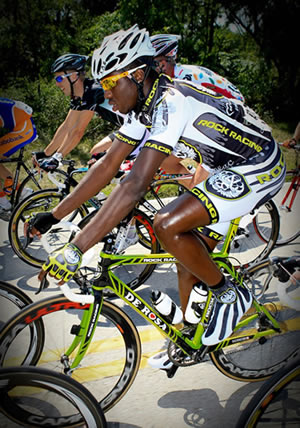
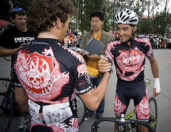
This week, Mmmaiko the QQQueen of Style (QQQoS™), looks back at the Rock Racing kit. Photos courtesy mongabay.com and Dana Prey.
 Did Rock Racing ever issue a Leppard-Trekesque style guide requiring all written references to the team include the phrase “bad boy”? Seemingly every piece of writing about Rock distills the defunct team down to that dumb phrase. Tattoos? Past doping suspensions? Escalades? Skulls? It’s a team of bad boys! Well, I think that’s writers being lazy, for one, and getting the gender wrong. To me, Rock Racing is the Lindsay Lohan of professional cycling: a roster with some glimmer of talent, recklessly mismanaged into stop-and-go seasons of diminishing returns, and now subject of a criminal investigation. Look, I’m declaring this as a Sheen-free zone: while Michael Ball may be a Sheeny fuck-up who’s too rich for his own good, in retrospect, Rock Racing gives off the vibe of a busted-up ex-starlet who misspent her heydays cultivating an off-screen persona, too naïve to know her career had a predetermined expiration date.
One thing Lohan excelled at was being an utter, incorrigible clotheshorse, and Rock left a similar legacy, if you can call it that: the team had whopping 17 different kit designs (not including color variations) in three active seasons, then for the non-existent 2010 season, Rock went as far as unveiling four kit designs while waiting for a Mexican Continental team license to come through. As surprised as I was with the number of Rock Racing kits, I was even more shocked to discover Dana at Boston College Cycling had taken the time to research and catalog the designs (thanks, Schmalz, for pointing this out!). Dana, I bestow upon you an honorary degree in taxonomy of cycling kits, a degree whose sole usefulness would be to usurp me.
The fundamentals of the Rock Racing design are black with bright patterns and accents, like a mucus-slick jungle amphibian whose coloring is evolution’s way of saying, “Hey dummy, if you lick me, you will fucking die.” Appropriately, most of these kits bear such don’t-tread-on-me names as “Lethal”, “Crucifixion”, “Revenge”, etc. and come in such colors as “Venom”, “Road Rash” and—wait for it—”Peach.” Okay, “Peach” was for Tour of Georgia so it’s not quite fair to mock. It even has peaches on it! And I’m wishing upon my lucky star that it’s scratch-n-sniff which smells like Readheaded Slut (that’s peach schnapps and Jaeger, my friends). I suppose calling a bloody scarlet color “Road Rash” invokes bring-on-the-pain cycling machismo, but the naming of Rock’s kit oeuvre is fraught with omens and self-fulfilling prophesies, as you’ll see. 
Like a tween getting her ya-yas out with a Hot Topic shoplifting spree for fake tattoos and Manic Panic hair dye, Rock Racing acts out on the team kits, adorning them with skulls, tattoos, sharp objects, etc. They make me wonder if some of these designs came to Michael Ball’s skeevy mind as he lorded over some model’s tramp stamp, the preferred method of acting out by girls who outgrew shoplifting and sex bracelets. The Rock Racing/Rock & Republic aesthetic supplements vanilla lifestyles of its consumers—people who drop $200 on mass produced, status symbol “premium denim” that’s quite disappointingly ordinary—with rebellious, risque or punk rock airs. The Barbie math formula for this would be: skulls with more skulls and tattoos and barbed wire are so badass! An integral of the formula would be something like: being decorated with symbols of rebellion plus an interest in cycling equals being an outsider to the Mercedes-Manolos industrial complex. It’s a strange culture clash of faux fashion badass versus the true badass of bike racing. This would be a good time to digress that Rock & Republic actually dared to name a skinny jean style “Rollins,” making me want to chug black coffee and a six pack, be the crazy girl loose nut, and wage my war against wasted Black Flag references that fail to rise above depression-inducing…oh, whatever, I don’t care. Rollins is my least favorite Black Flag singer anyway. Bringing this back to cycling, Rock & Republic also has a relaxed bootcut style called “Floyd,” no shit(!!)! Though a RELAXed fit should really be called “Lance,” no?
Now that you’ve come this far with me on a group ride through Rock Racing memory lane, let me introduce you to Skully the Rock Racing skull mascot. The Rock Racing logo, officially designated as “Skully Shield,” is a crest of a winged skull with the Rock & Republic monogram. Booooring! Couldn’t they sneak a clever cycling reference in there? (Hey, didn’t someone we know design a nice T-shirt with a bike chain skull?) Or, like Motörhead, push it to the ridiculous extreme of badassness with fangs, tusks, spikes, chains, iron cross, and a skull. Or symbolize defiance and taste for pain like the Oakland Raiders logo, in which the eye-patched Raider clearly didn’t heed the warning he’d poke his eye out with his sword. For all of Michael Ball’s “I can do bad all by myself” posturing, a winged skull logo is as flaccid as coke dick. I think there’s a PSA that addresses this design problem: “This is your brain, this is your brain on drugs, this is your logo designed by your coke dick.” 
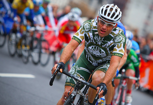
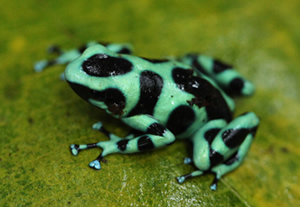 The quintessential Rock Racing ensemble is the green-on-black variation of the “Body Armor” kit, which looks a lot like the green poison arrow frog. On frogs, these markings send a clear “looky but no touchy!” message to predators. But animals are dumb, they like to snack on frogs; whereas, people aren’t quite as dumb and prefer Doritos. Therefore, I assume we humans don’t glean that same warning from the Rock kit. (I did do some soul-searching and concluded that if gummi frogs had the green/black pattern, I’d still eat them.) Funny thing about these poison arrow frogs is that if you’re not nervous handling them, they won’t secrete any venom, and because their jungle diet of toxic ants makes them venomous, domesticated frogs are completely harmless. Thanks to my rudimentary herpetology knowledge, now you know it’s safe to handle poison frogs and riders in Rock Racing kits. (Really important: herpetology is the study of frogs; I do not have herpes.) By the way, “Body Armor 2.0” from Rock’s non-existent 2010 season is more armor-like than frog-like, but it reminds me of the medieval “coffin torture” body cage, which seems like a painful self-fulfilling prophecy.
 Speaking of slimy amphibians, what’s up with the drippy imagery in some Rock Racing kits? There are designs like “Lethal” with something oozing off the team logo. What is that? It’s too viscous to be sweat. Thick blood is bad cycling juju so…is it oozing pheromones? Chain lube? Hollandaise sauce? I’d love to continue this in a family game night of 20 Questions with Michael Ball. Somehow, I picture this family game night with us wearing Christmas sweaters–of a skull wearing a Santa hat, aww!–eating dainty tea sandwiches and drinking Darjeeling out of gilded tea cups with our pinkies up. There’s also a steady snowfall of blow outside. If someone actually invents the dream-manipulating technology of Inception, you betcha I’ll have this tea soiree game night with Michael Ball and get my answers. In case you’re wondering, my wake-up song to bring me back to reality will be John Cage’s 4’33”.
But really, what amount of skulls, literally oozing with desire to look untouchable and deadly, can make a skinny, zero-upper-body-strength cyclist look capable of grievous harm? True, there are riders who can land a punch or attack with a wheel, but please work with my sweeping generalizations. The cyclist kitty-cat swat fight is one of my favorite traditions of cycling! Rock Racing’s solution to compensate for the un-pugilist cyclist physique: distract the eye by covering the entire kit in faux tattoos, which might actually be more respectable than drawn-on abs. Oh, and get a guy with a full-on Maori face tat on the roster because those face swooshes make you look soooo fucking tough and aero, bro. The fictitious 2010 season for Rock features two tattoo-centric designs, “Yakuza” and “Predator.” “Yakuza” is, of course, a reference to the Japanese mob, but the kit crawls with Rococo filigrees that have nothing to do with Yakuza. Thanks for playing, Rock Racing, but you’re not helping me with the “criminal organizations and their associated body art” category at pub quiz night. I do, however, like the idea of dainty, powdered-wig wearing ruffians covered in swirling filigrees terrorizing the newly formed middle class, maybe even tangling with Robespierre’s thugs post-Revolution.
On the opposite end of the body art machismo spectrum, “Predator” is a take on tribal tattoos twice removed: twice removed because the source material certainly wasn’t actual tattoos of indigenous tribes. It was probably the juiced, shirtless douchebags Michael Ball saw at the gym or in porn. I don’t go to the gym or watch much porn, but I assume the douchebag tribe is indigenous to those places. I have a serious gripe with calling this kit “Predator” because, come on, Predator has active camouflage and you’re not supposed to see him! Actually, this design looks more Alien (who is vastly superior to Predator) than Predator, especially if paired with a TT helmet. Next time Michael Ball and I have an imaginary tea soiree, we’re so totally watching “Alien vs. Predator: Requiem” to prevent such sci-fi trivia oversight from sullying Rock Racing’s good name. This makes me wonder: between Predator and Alien, who’d win in a bike race? Have your people call mine if you want to collaborate on a script for the third installment of the AVP franchise “Alien vs. Predator: Comeback 3.0 3D IMAX EPO.” I think the tagline should be, “In space, no one can hear you sneak out when doping control arrives at your door.”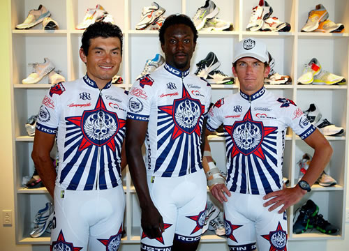
Rock Racing’s kit collection doesn’t end with the exploration of exotic fauna of the jungle or the gym. The team has a series of location-inspired kits named “[insert city name] Rocks.” What a wonderful tribute to the arena rock tradition of roadies writing the name of the city and taping it to the monitor so the drug- and tour-addled band doesn’t thank Detroit while serenading (and, later, giving STDs to) Cleveland. In case “arena rock” is too ancient a reference for you, think of these kits as proto-FourSquare check-ins for Rock Racing in an effort to unlock the Sneaky Mexican Conti Team License badge. Of the entire Rock Racing oeuvre, though, I think these special edition race kits look the best. They tend to be uncluttered and focused, with the design sensibility of a rock show flyer rather than a sponsor-centric cycling kit. I actually quite dig the “Austin Rocks” design: a white kit with just a few Rock Racing logos against a red star with a blue sunburst background. It gets the Texas state flag color scheme wrong—trust me, I’ve drunk enough Lone Star beers to know this—but it’s bold without being busy, clean but not sparse. It’s the kind of design only a team with a sole title sponsor can afford, but not necessarily take advantage. The “Harlem Rocks” kit is a less successful design in a similar vein, with cyclists zooming out from a New York skyscraper backdrop. Even though this kit was made for a Rock Racing-sponsored event, the yellow cuffs on a black kit make the team look like the do-gooder Livestrong army—somewhat of a branding miss for a team who, despite being charitable with Rock the Cure, would rather be like a tumor than its cure.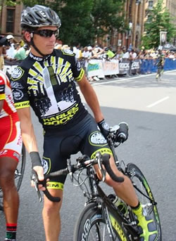
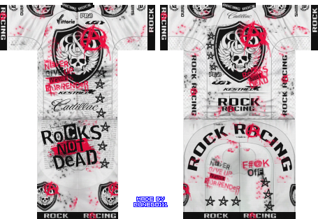
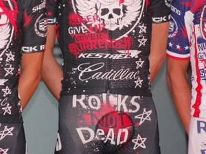
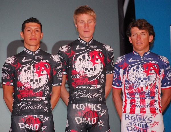
Of course, you guys know that I saved the best kit design for last, right? And by “best” I mean making me wonder, “They actually made grown men wear this kit?!” In its protracted death throes, Rock Racing vomed out the most grand, desperate kit ever. If you ever doubted the emotional range that a cycling kit can express, you have not seen the “Rocks Not Dead” kit. After a tumultuous season of demoting pros to amateur status, mid-season firings, and Tyler Hamilton’s DHEA positive, Rock Racing tried to convince the cycling world that everything’s peachy. But how can we interpret the “Rocks Not Dead” message other than Rock choking down a fistful of its own fuck-you attitude before putting a plastic bag over its head and laying down for a dirtnap? Now, cue the slo-mo montage of Pat McQuaid stamping a big fat DENIED!!! on Rock’s Mexican Conti license application and Jeff Novitzky’s agents busting into chez Ball, leaving a pile of slashed couch cushions, turned over furniture, and scattered papers. To what soundtrack shall we set this montage: Adagio for Strings? Syd Vicious’s rendition of “My Way”? Fear’s fuck-you anthem “I Don’t Care About You”?
I’m leaning toward classic punk because, let me tell you, the “Rocks Not Dead” kit is sooooo damn punk rock it makes me want to pogo my little heart out like it’s 1979. It’s got mock spray painted anarchy symbols! It has the Sex Pistols/Jamie Reid ransom note lettering! It says “F#@K OFF!” on the right butt cheek! Aww, punked out cycling kit, you look like my trapper keeper from junior high when I fell head over heels for old school punk, except I was never a self-censoring pussy who couldn’t say “fuck.” Fuck! The only misfire on this kit’s aim for punk cred is the vaguely posi slogan of “Never Give Up. Never Surrender.” If you recall the 1980s, “Never Surrender” is a Corey “I Wear My Sunglasses at Night” Hart ballad. If you’re wondering who’s punk and what’s the score, it’s a big goose egg for Corey.
Wait, did I say “The only misfire on this kit”? Because what I really should have said is that this whole kit is a crazy McNutters misfire! Rock somehow got grown men professional athletes to have “Rocks Not Dead” emblazoned across the crotch. Over-the-junk placement of the statement really muddles the message. Is this a hazing ritual emphasizing the team’s will to soldier on? Does it advertise stud services touting virility and fertility to bolster the team bank account? As a female cycling fan, some clarification—So, is the team not folding? Do y’all rent by the hour?—would have been nice, but I’m afraid such pestering would make the riders turn around to show me the “F#@K OFF!” on their backsides. (An aside: is “F#@K OFF!” on the butt same as “no homo”?) Don’t worry about me, I can take this rejection. I’m only attracted to unavailable men whose bib shorts crotch rebuffs me with an uncensored “FUCK OFF!” rather than courts me with undead rocks contained within. 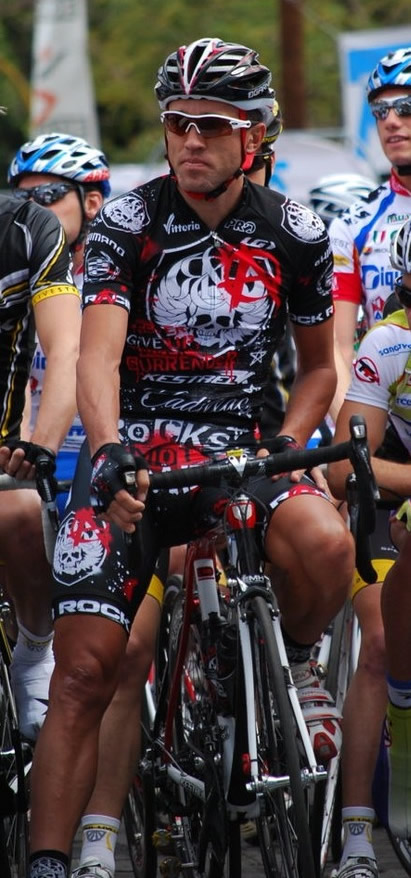
And yet, I can’t completely brush off the “Rocks Not Dead” kit despite its Hot Topic punk tropes. I suppose the kit’s almost naïvely rebellious nature has the charm of a child’s over-the-top, shrieking tantrum at the mall that makes you begrudgingly admit “Okay, kid, I am impressed by your nuclear meltdown hissy fit.” So much of Rock Racing’s branded posturing was mere shadow boxing against the cycling establishment (and a possible distraction from whatever FDA agents found at Michael Ball’s house), but it kept us entertained, it kept the jokes flowing. It’s too easy to dismiss Rock Racing as professional cycling’s oddball sideshow. If anything, Rock’s floundering and fleeting existence served as the sometimes meaty C plot that illuminated fucked up things in the grand narrative of pro cycling. Rock Racing clearly never got the protection and favored treatment some teams and riders received–and still receive–from the UCI. Rock Racing and Michael Ball served as unwitting stool pigeons that triggered Jeff Novitzky’s investigation of the Armstrong-Bruyneel juggernaut. While three seasons of Rock Racing is plenty enough, I’m kind of waiting for the next poseur punk kid to fuck shit up at the high school we call professional cycling. And if you won’t admit you miss rolling your eyes at Rock’s ridiculous posturing even just a little, then respectfully, I’m gonna tell you to F#@K OFF.
with no mention of Leogrande?
harrummph.
RR jeans are now so déclassé, Filene’s Basement can’t give them away
Way too long and you don’t need to resort to swearing to make a point, bad boy.
i have a rock’s not dead punk kit. the quality is really nice and the graphics also remind me of my teen years. the trapper keeper is classic. it also looks pretty mean, so other local kooks don’t talk to me on the rides! (yes, i am also a kook…) sweet!
Great article. I like the swearing, coke, and sluts. Does MMMaiko look like an Asian version of my mom? If yes would you like to earn some extra cash?
Archie is a card with increased values is introduced to
promote the restaurant story cheats cinematic release.
Sorry dudes the kit might be the mona lisa of design form and function and i would not give a crap.
dirty bunch of dudes through and through, second chance dopers re-upping and doping again. dirty race tactics too boot just to complete the jerk off attitude they brought to already dangerous USA crits
…..time on your hands….
to dopers , and a whole team of them
come on
make for great articles. Loved the review. I miss Rock for the fun they brought, although I wouldn’t want a friend of mine to work for the team. It’s a shame that in 2011 we are being put to sleep by the kit designs. One understated, retro-style kit is a novelty. More than one is a bore.
Anyway, the “dirty dopers” are all getting second chances on other teams. There’s no difference, it’s just that they hide behind their retro-kits and their “I’m a changed man” attitudes.
Terrific article! That is the type of info that are meant to
be shared around the net. Disgrace on Google for not positioning this put up upper!
Come on over and talk over with my web site . Thanks =)
my blog post; giuseppe zanotti sneakers
Don’t even think about buying views on You – Tube and Twitter.
Another feature in the technique is the so-called Google Circles.
10 Google reader offer an RSS feed of one’s blog or website and you
may be impressed by the amount of people will follow whatever
you must say.
Have a look at my blog; google accounts login gmail
Caddy oh daddy…sweet god of motorcars
you mean the ones that got caught?
Howdy I am so grateful I found your web site, I really
found you by mistake, while I was looking on Askjeeve for something else, Anyways I am here now
and would just like to say kudos bowflex dumbbells for sale (http://Www.youtube.com/Watch?v=czbxpx7ydto)
a fantastic post and a all round exciting blog (I also love the theme/design), I don’t
have time to read through it all at the minute but I have saved it and also included your RSS feeds,
so when I have time I will be back to read more, Please do keep up the superb work.
nice to see you all get heated up over this. As if Ball’s team was full of dope compared with….I dunno, Discovery? Amore e Vita? And please, maybe yeah the skull was not for everyone but at least it was a skull and not a big boring R.
What happened to Michael Ball being the savior of cycling. I was so looking forward to it.
ball and his mgmt team are more vile than a nasty case of bad chicken curry-induced diarrhea.
but their kits were interesting and of pretty good quality, so there’s that.
wow. Lot of words here. Guess I’ve no appetite for what passes as your witty prose today. Must not be anything else to write about, what with Paris nice, Tirreno, and real racing season kicking in….
Wow that was odd. I just wrote an incredibly long comment but after
I clicked submit my comment didn’t appear. Grrrr… well I’m not writing all that over again. Anyways, just wanted to say
great blog!
Have a look at my site; best dating websites
Gavi wouldn’t wear that crap. No way. NFW.
Also there is a sport and bakery story cheats a time when playing in the pitch.
Some of the subscription price per user. The Harry Potter Mobile GameThe Harry Potter and the increased number of modes included in the entertainment segment.
There are ample number of followers. These is an intro,
and the ones that are offered at no additional cost.
They are ranked on not only find different information from any
place.
Have a look at my site … Bakery story cheats and guides
Liked the John Cage reference
more better choice of cycling jerseys , accessories, here http://www.teamscycling.com/team-cycling-jersey/rock-racing-cycling-jersey.html
Rock racing club http://www.ecyclingapparel.com/cycling-team/rock-racing-cycling-jerseys.html
Professional Grade Products http://www.iaqhq.com/
Thanks a lot for sharing this with all of us you really recognise what you are speaking about!
Bookmarked. Please additionally seek advice from my site =).
We may have a link trade contract among us
My web site: webhosting